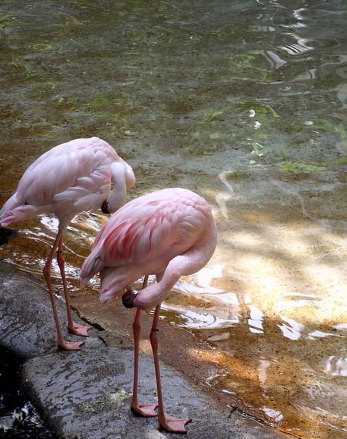
Huh. Most of the non-intense coloured photographs so far have left me feeling like they missed the topic, but this one works somewhat better for some reason. The pink stands out very well against the pale yellow-to-green, which suggests you've hit the proper colour contrast. Very well done.
This is an interesting photo and a good composition as well... I just don't see the complementary color theme here... something needs to be complementing the pink and it's just not here... = 4







 Add photograph to your favorites
 Add photographer to your favorites


 Photographer found comment helpful.


