I decided to try the candy thing again since it worked so well the first time... we'll see what happens. Not expecting such a spectacular finish this time around, though.
Statistics
Place: 42 out of 82 Avg (all users): 5.6204 Avg (commenters): 5.8824 Avg (participants): 5.5862 Avg (non-participants): 5.6600 Views since voting: 1269 Votes: 108 Comments: 21 Favorites: 0
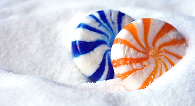
Composition: A well composed shot with good use of basic rules of thirds and negative space.
Technical: Great color rendition without much use of post processing. Focus is too soft on blue candy, could have used better control of depth of field. Very nice whites.
Challenge: Definitely meets the challenge with true colors.
Suggestions: Your original concept has proven the impact of this type of photo, but your use of an unoriginal idea has hurt you quite a lot. Probably a hard lesson, but still a nice picture. I scored you a 6 in the challenge based on your soft focus on the blue candy.
Your contribution to the site is a pleasure for all of us and I look forward to seeing more of your work.
Disclaimer:
Bear in mind that I am here to learn, just as many others and any comments that I have made are not intended to be offensive in any way, and are only constructive criticisms. If you wish to comment or discuss this critique please feel free to do so at any time.
Thank you,
Dick Pattee (Autool)
Autool@attbi.com
Doesn't have the same pop as the original and it's a rip off of your own stuff! lol In good news, at least dpc taught you something this week? Oh - and I love sugar as a bg - thanks for reminding me. Anyways - better luck next time (I would bet the score isn't being kind to you).
Seems to meet current challenge requirements for complementary colors, but I have to ask if this one is left over from the Candy challenge. I like the focus and lighting.
The brightness and the saturation of the colours work very appealing. You also did well on the composition. It's a tiny bit out of focus and there is an over-exposed area on the left of the blue candy. also, the image has kind of a magenta cast. (e.g. the shadow areas of the sugar)
Technique: 2/4
Composition : 2/3
Originality/meeting the challenge: 2/3
Total = 6
Interesting idea, although if I recall correctly there was an entry similar to this in the candy challenge. The two candies here look quite snug, but I think the blue one is slightly of focus, especially near the top.
good use of complementary color... the theme works well. I believe the depth of field is a bit too shallow for this particular shot. I can't see any purpose in the blue candy being soft in this shot... the sugar also has quite a few hot spots in it... maybe the shot is just a tad over exposed... = 5





 Add photograph to your favorites
 Add photographer to your favorites

 Photographer found comment helpful.


