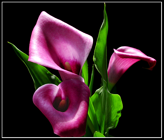
One of my favourites this week. Good composition and the colors are perfect. So is focus and the cropping. Perhaps I had made it a little darker. Border perfect too. Meets the challenge very well. Well done and good luck!
Very pretty...I like the lighting in the green foliage. The light on the purple bloom is a little too harsh. A little close on the top crop. Colors do not meet the challenge though.
for such harsh lighting you've certainly caught the colours very well - especially the green. Think the highlights are a little over-done: makes it look like a plastic flower.
This is a lovely picture, and the coluor combination is certainly attractive, but the shade of the purple is not quite as obviously 'complementary' as a redder tone would have been.
Wow, vibrant colors, although a little tinged on the pink/purple side than red to me. The lighting really brings out the depth of the image, and the shadows add just enough mood to make it appealing to me. If I were to be very picky and want to change anything it would be the top of the leaf peeking up from the bottom and a little bit more light on the tip of the right flower.
beautiful calla lillies... i think the lighting on this shot is pretty good also... I think the part that is missing here is the complementary color theme. purple and green aren't complementary... purple and yellow are however... the yellow insides of the blossoms are not holding their color in this photo because of the angle of lighting... = 6
The extreme lighting works nicely. I love the green in this shot, although I feel the complementary red is a little over lit as it looks purple. 8 -danny







 Add photograph to your favorites
 Add photographer to your favorites


 Photographer found comment helpful.


