*Critique Club*
I always enjoy reading the comments on photos. But when I see a group of comments like this, I really have to laugh and hang my head. I have to wonder what photo some of these people were actually looking at. To say that you used the rule of thirds well here, is not only misleading, it's wrong.
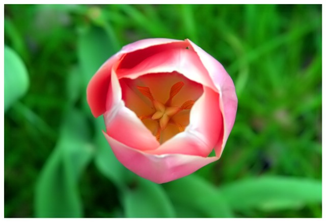
You didn't use any "rule of thirds", and I think that's great. Not a single item in this photo falls on a third. lol. I like the centered framing of this shot. I think that with some things, it's ok, and this is one of those times where it's ok.
This flower does seem pink, which is fine, but not for the purpose of the challenge. I'd like to have seen a red one for that. However, outside the challenge, I think that the pink colors stands out nicely on the green background, and I also like the colors inside the flower.
I do like the DOF, but think it would be more effective if the inside of the flower weren't so dark. We can see that the flower is blurred, and it looks intentional, the background is blurred intentionally, and we assume that the insides are nice and crisp, however, it's a little hard to tell.
I think that you blurred the background nicely to get it out of the way and be less distracting to your subject. I do think though that you might have overlooked the solid light green (leaf?) to the left of the photo near the upper left. I find that to be drawing some attention away from your subject.
Overall it's a nice shot. Pretty flower, and decent surroundings. Quite a common theme in these last few challenges, but still ok.
~Heather~
I like your use of focus here, with the sharpest being right inside the flower. if the flower were off center, it would indicate that it was part of a larger picture. Centered, it is isolated.
My eye wants to see inside the flower but its a little dark(just on the inside). The brighter unconnected green on the left is a little distractiong. The "Rule of Thirds" really does work too. Nice blurr on the background. Good Luck
I think perhaps the flower is a bit too pink-and-orange to truly emphasize the contrast of complementary colours, but good thinking (as you probably have seen by now this turns out to be a common theme) and good placement -- I like how the flower seems to jump out at you.
A good, straightforward, down-the-throat photo of a blossom. The focus is good (I like how the entire flower is in focus, especially the inside where the eye is drawn, but the background is blurred), the lighting decent, the colors nicely saturated. Technical mastery of the medium is displayed, as it were. :-> I can see it as a nature-magazine photo, or something else trying to document that flower ... but nothing particularly makes it pop for me. 6.
Good use of DOF. Colors are vibrant. Might liked to have seen this flower blossom at more of a side angle rather than directly above. I've become very picky with the flower shots since there have been SO many of them. 5
The out of focus leaves and out of focus background, combine to make this whole shot look out of focus, even though the flower internals are not too soft. Unfortunately the background still has enough detail to look messy
From my laptop monitor I could not make out the detail inside. This has some nice tones throughout. I'm not sure if you're going for green and red as the flower looks pink. The overall composition is kind of 'in your face' and with the DOF as shallow as it is, it puts the emphasis on the blurred tips of the petals instead of the darker inside. Overall nice flower shot. 6 -danny
I probably would have created a square crop for thi shot... It would make the centered composition seem more 'ok'. that part of this shot that is in focus is inside the flower also. That is probably gonna create a lot of 'out of focus' comments on this shot... = 6
I like the shot. The focus is right down inside the flower - interesting. For this challenge, though, the red isn't very red. I'll say 6, though, for it being a great shot. Almost looks like the flower head is floating here.






 Add photograph to your favorites
 Add photographer to your favorites


 Photographer found comment helpful.


