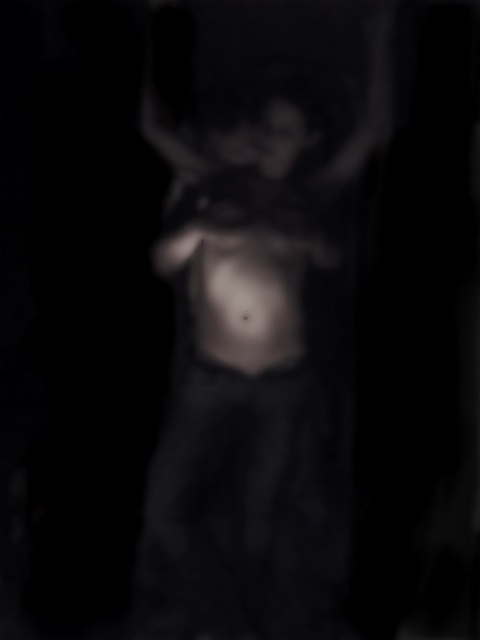
Great idea here, though I think the extreme blur makes the image uninteresting. I think that using this same type of idea, but in razor sharp focus, with a black background and interesting shadows on the models could have the potential for a top 10 finish.
I would love to see this sharp and in focus. It looks like a cool shot but I think the attempt at abstracting(is that a word?) it only hurts the image.
Looks like you had a good basic idea (I remember the brilliant Janet Jackson portrait with the same pose) but you've failed to capture anything resembling a decent shot, shame.
You might want to try moving the subject off of center. I would still consider breaking the rule of thirds here. An unexpected subject position would add interest to this image. Otherwise you might crop off some of the black space.
I get the feeling that this would be a great picture if only it were focused! I feel like Grandma when she forgets to put on her glasses! The girl's pose is elegant, and the way she puts the weight on her legs is quite elegant. the friendly fellow behind her was a great way to maintain "decency" while also adding an erotic element. I can't tell way the greyness behind them is. What it makes me want to see is a backlit veil in front of these two, which would lend the sort of myserious air I think you're going for here while also maintaining technical precision.
Definitely interesting, but I find the jet-black shapes in the background distracting. I'd prefer a tighter crop and all the background either jet black or that mottled dark gray, but not a mix. Also a subtle splash of light on the two faces might give the viewer's eye more to hang onto, without ruining the lovely intemacy. In any case, a daring attempt that is undoubtedly too "arty" for many DPC'ers, but keep it up!
This is a great shot, and I like the concept completely. that being said, better lighting is a must, as well as to eliminate the "not part of the challenge vote, creating an image where the crop is just below the belly button would have improved the shot as well.
I like the idea/concept of this shot. I would like it better if the subjects were closer to the camera or the crop was different to remove more of the bottom half.
I dont understand the use of the blur for this photo. i thik it would have been an excellent photo even as dark as it is if it had been more defined and focused. comp is good and pose looks fine.
Could've worked ok, but WAY too blurry - I know you probably meant to do that. If anonymity was an issue, cropping the heads and/or framing the mid-section would've been a better way to go, IMO. Hope this helps. Good luck.






 Add photograph to your favorites
 Add photographer to your favorites


 Photographer found comment helpful.


