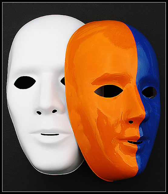
A very interestimg study and a new take on a universal concept. Here in presenting three colors it evokes the triangle. This adds a completely different interpretation. The standard mask of comedy and tragedy speak of the human realm of existance. In this study it climds to the psychological concepts of whole and split or whole and defragmented. This picture has a strong appeal because of its hidden message. A very good composition and great colors. A way to make this a masterpiece is to use files and sandpaper to correct the cut-outs of the mask. Outside of this, this is a super study.
*Critique Club*
Excellent. I really like this, but there are a few nit picky things that I can mention that I think could use a bit of adjusting.
First, the objects that we can see in the colored masks eyes are a bit of a distraction. I think it looks like the edge of the other mask, and a cord that might be used to hand the mask? There is something in both eyes, and the mouth and maybe covering them up the distractions with something black might have helped it to blend in with the background. I disagree with the comment to move the colored mask, as I think that the setup is great. I like the positioning of the masks.
Other than those small things, I think the shot is great. The colors are really excellent. They are bold and very strong, and stand out against the background and other mask very well. I disagree with using 2 white masks, because the purpose of this challenge is the color. Maybe outside the challenge, that might be something to try, but not for this challenge at all.
I like the angle and framing/cropping you chose. I think that the centered setup works well because of the tilted angle of the subject itself. While I like this, I also wonder if a little more space around the edges would work, or if it would make it look 'lost'. Something to try out of curiosity though.
Focus and clarity are really great. Very sharp edges, and not over sharp.
The black background works perfectly. Nothing distracting there. Helps the subject really jump out of the photo. Nice.
Last thing I can mention is the lighting. At first I was like...EEK look at all that glare and reflection. But looking at it, I think it and the lack of glare and reflection on the white mask, I think that if both masks were like that, than this would be a boring shot. I think it would be flat and less exciting.
So I think you did an excellent wonderful job. Great shot!
~Heather~
I wish you'd moved the right mask a TAD right so that we didn't get the edge of the white one in the orange eye. And we could see more of the white dude's face. I love the contrast of colors and the two you chose are fantastic. 9.
I dont know what i like about this photo so much, maybe its the shine in the mask to the right, but i really like how each colour is in its place and the background colour is good too. 8
One of my favourites this week. Great idea. Good composition and the colors are perfect. So is focus and the cropping. Meets the challenge very well. Well done and good luck!
This works. You have the orange/blue contrast and the black/white one, and the staging of the scene does not scream "Hi! I'm a big staged scene for the sake of a contest!" as I can imagine someone leaving a couple carelessly piled masks in that way.
I had a notion to use masks for this challenge, masks and balance, something like that, but couldn't figure out HOW. This is beautiful! No nitpicks. I hope you do well with this entry!
I like the simple composition here..I wish more of the blue part of the mask was showing, but don't wish it enough to mark you down for it or anything. :) Focus is very nice, as is the lighting. There are highlights and reflections on the mask without it being too distracting.
I like how the base white mask is there as well as the painted one instead of just having the painted one. I'm not too crazy about the reflections on the painted mask, I probably would have preferred shadows instead. That said, the colors are vibrant and the image very sharp and clean, and stands out well with the black background.
nicely done... I think this image would have also been excellent with both masks painted the same way... just for fun, i think two white masks would also work very well here :) = 7





 Add photograph to your favorites
 Add photographer to your favorites

 Photographer found comment helpful.


