*Critique Club*
I keep getting an error message trying to post this, sooo, here I go again...
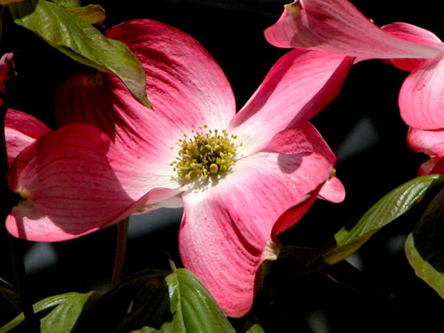
I think that people got run down with flower images in these last few color challenges. While I think that this is technically well done, I'm afraid that it's not very 'different'.
The angle and framing/cropping are ok. I even don't mind the little flower peeking in from the upper right. I like how the color is mostly at the top, and the bottom is kind of plain.
The focus is a bit soft. I would like to see some extra detail in the center yellow part of the blossom, however, we still get really nice detail in the petals of the flowers. I like the lines shown.
The colors are good in my opinion. Yeah, there are a few places that look a bit pink, but I can see the red. The pink is probably just the redness being diluted by the lighting. Not a big deal. Fits the challenge nicely in my opinion.
Speaking of the lighting, I think that it's ok on the flowers, however the shadows being created by the leaves are a bit of a distraction. I think that fill flash is what is used to help reduce shadows in unwanted places.
Overall, technically well done.
~Heather~
Hmm, I begin to suspect this will be a common theme. This is nice, however; it meets the criterion and the overlap of leaf and peta, particularly at the top left where the deeper colours meet, captures the essence of the topic nicely. It is also framed well, with the focal points surrounding the center.
harsh shadows and the leave in the top left is distracting. A cloudy day or hold a difuser over the light would make this a better photo. Nice textures
i feel this is more pink than red. The shadows are a bit harsh too, which takes away from the elegance of the flower. I think too that the focus may be a little soft, but not badly so. Compositionally, there is something missing that gives a centre of attention, perhaps if the rightmost flower petals from the other flower were cropped out? Just some ideas. :)





 Add photograph to your favorites
 Add photographer to your favorites

 Photographer found comment helpful.


