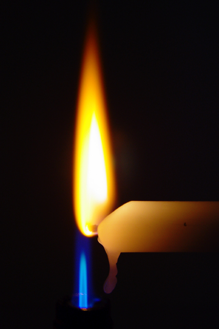
CC: The two flames make a good complementary colour choice. The harder part is then making it in to an interesting subject. The main problem is getting the lighting interesting on the subject matter and I don't know that you've really achieved that too well here. The overall feeling is drab and dark, particularly with the white/ yelllowish candle.
however, I'm not sure I can suggest an approach that would make these subjects more lively or interesting. Perhaps a more interesting candle choice could have helped or a lighter background. You might have lost some of the flame detail then but it could have lifted the overall impression of the shot. The yellow flame also seems quite overexposed - again difficult to get right with the selected subject matter.
Oh, keen setup. I do wish the flames had been closer in size; the yellow part of the image somewhat outdistances the blue as is. But definitely a nice exercise in the contrast.
the idea is really neat, and the photo is really well done, except from a composition standpoint i'm not sure if the flames benefit from being on top of each other rather than more side by side or diagnal to each other.
Simple and unique. A little more narrow of a crop would help accentuate the height in this shot. The added black on the left doesn't add to the composition. Still a very strong shot. 8 -danny





 Add photograph to your favorites
 Add photographer to your favorites


 Photographer found comment helpful.


