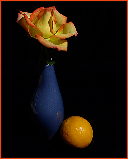
The lime just seems out of place...maybe if it were on a black plate, and with one or two other pieces of fruit, it would feel more in context. As it is it feels to me more like a well-done study or test than finished piece.
This is very surreal, but it's a good implementation of the colour complements. I like the fade of light at the bottom, good angle of incoming light; it helps focus on the contrasting colours.
I can see the desire for a border, since the objects seem to 'float', but why in colour and bold?
The texture of the rose appears discernibly 'woven' and 'died', as I'm sure you know. The vase and orange, however, evoke a more primal idyll - a stunning one at that! I cannot help but regret an aesthetic discrepancy.
interesting composition... I think there could possibly be a little more lighting on the vase.. a good portion of that is being lost to negative space... it would also help remove the feeling that this stuff is floating in space since there is no visible surface... The red border is a bit distracting...it's competing with your subjects for attention... not a good idea... = 5






 Add photograph to your favorites
 Add photographer to your favorites


 Photographer found comment helpful.


