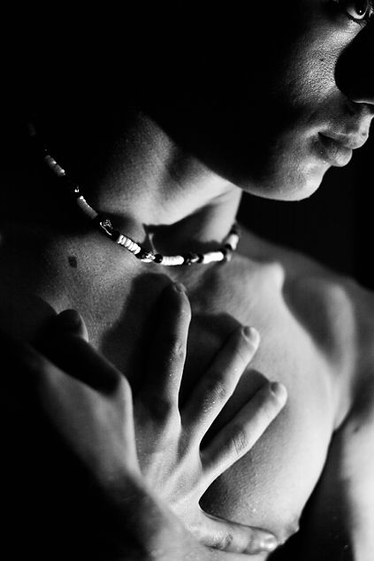
Oh, and I know my eye is really close to the corner of the frame... but this is as good as I could do with a broken camera w/no autofocusing or metering.
RAW processing/USM.
Statistics
Place: 40 out of 118 Avg (all users): 5.7391 Avg (commenters): 6.9756 Avg (participants): 5.5326 Avg (non-participants): 5.7877 Views since voting: 4199 Views during voting: 1222 Votes: 483 Comments: 46 Favorites: 2 (view)
My comment would be sooo different if you weren't 15, great picture! I love how your eye is almost out of the picture, draws my attention and makes the picture unique and different.
Is that you, nico_blue? I find the necklace distracting, primarily because it's several stops brighter than anything else. The eye at the corner of the frame draws my attention and makes me wonder what's going on offscrean; in most cases this is a bad thing, but I think that it works to your advantage here. I think that the eye would have been a greater asset to this picture if the surrounding socket was visible, which would help to convey more emotional information; a stronger catchlight would have helped to.
I like the light on the face and the one eye and how the image is cropped. Good use of shadow to add depth. I think the hands create a bit of a mess, are confusing, would probably have been better with only one hand showing.
This is nice I think it would have been better if your left hand would not have been in the photo. I love the focus on your face. I admire you strenghth to submit a nude photo of yourself. good luck.
Good for you. Looks like a nice face-body combo :-)
I like the composition, crop, lighting, necklace, positioning of the hand, texture of the skin, your right eye in the upper right corner. VERY COOL SHOT!
Terrific composition and cropping! Makes an interesting and original image, if a little disjointed or fractured (which was clearly part of your intention). Right hand is wonderful, spread on the chest. The left wrist & hand are not clearly defined, and I think are therefore slightly confusing. But a good, original idea. 7
I think it was a dramatic decision to crop around a bright clear eye jammed right against the edge, but still think it would make a better picture with just a little more margin around the eye. Just a little. Great expression, good lighting.
I like the contrast in this photo. The one blurred hand in the front is kind of distracting. I probably would have left a little more of the head showing.
your left hand, which is out of focus, is covering your right hand, which is in focus...maybe the shot would have looked better without the left hand in the shot as there would have been more "in-focus-area"
am I going to get arrested? It's got mood. The only thing that is distracting is the nose shadow. Start collecting some small mirrors and using them to reflect light back into places you want to lighten up. If you know you are going to b/w, you can also mix up the types of light you use.
Very smart composition. Nice use of lighting, very effective. I really like your choice of framing, the comp. and lighting form nice lines and draw my attention to the eye in the corner. I find that very interesting. I'm undecided if the necklace adds or detracts from the image, so either way that's probably a minor thing. Very good job. :-)
An interesting and artistic composition. The left hand - how it's cropped and lighted - seems to get lost and distort the image in the lower left a bit, IMO. Good work overall and good luck to you.
Leaving the eye in was a stroke of genius. I find the foreground arm mildy distracting, but not overwhelmingly so. Nice tonal range, excellent lighting. Very well done!
the focus on the cheek is good yet the body seems just outside of the foocal range, with the nipple and the top hand almost lost to bokeh. This image would be a lot stronger if the model was wholly in focus.
i like how the facial skin is detailed and wish the whole shot could have been in focus and detailed as that part. the lighting is good and sets up intereting areas of highlight and shadow. however i feel that some of you highlights are a bit blown out.
I love the light and shadow of this shot. Great strong diagonal composition and inclusion of the eye. The only thing that distracts me is the left hand blurred out in the bottom left. I think the position of the other hand holds enough interest without the left hand competing for attention.






 Add photograph to your favorites
 Add photographer to your favorites

 Photographer found comment helpful.


