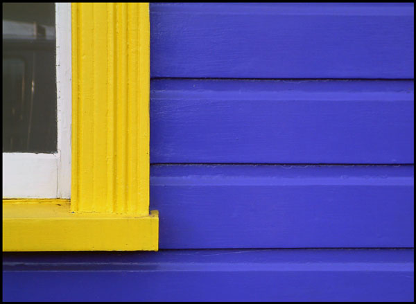
I have never understood until now why people paint their houses that shade of blue. It's to give photographers a way to enter good pictures into these contests! That's a terrific example of complementary colours, almost precisely as contrasty as they get (I know purple is traditionally considered the complement of yellow, but that blue is actually closer to what I tend to picture it as).
Frankly, perhaps not a 'great', coz it's a 'limited' albeit 'topical' pleasure. On the other hand, I can see how hard it is to resist taking it. :-) The colours are just 'wild' together. Eat your heart out IKEA!
nicely abstract and good strong colours and composition. Might suggest being even more agressive in the cropping and lose the glass, or even the white areas.
Beautiful photograph, excellent lighting, composition and color saturation, but these are primary colors, not complimentary colors. I like it so much that I'd hang it on my wall but unfortunately have to mark it down a couple of points for not meeting the challenge.






 Add photograph to your favorites
 Add photographer to your favorites


 Photographer found comment helpful.


