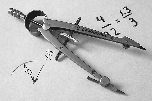
Just a bit of info; the equation is 4/9.2=1.3/3. There seemed to be some confusion on this but I guess I shouldn't have covered it up so much. I didn't thing people would take notice of the minor details.
Very nice detail and contrast. The paper could be a little whiter, but I like the texture you can see in it. The writing / drawing could possibly be more consistent looking. The thin and thick lines don't work as well as they could, IMO. Also not sure I like the compass obscuring some of the printing. Small nits. Well done!
Wonderful compositoin and clarity on this photo... the soft shadows work very nicely here! This is one of the best photos out here this week... great job!
I like the subject -- a litle over-sharpened for my taste, though. Also, I have one of these -- I think this version is technically known as a "bow-pencil" -- mine has a cool double-nibbed india ink tip which attaches where the lead is...






 Add photograph to your favorites
 Add photographer to your favorites


