*Critique Club*
Hi again.
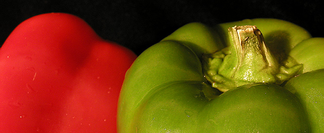
There are two things in this image that are just screaming out at me. First, I think this would be much more effective with a stem on the red pepper as well as the green one. I think that it would balance it off a bit, and it would also define the red blob in the back as a pepper.
Second, the water droplets are not adding anything to this shot, and I actually find them a bit of a distraction. Sometimes waterdroplets are effective in creating a nice visual effect, and sometimes they look like a sad attempt to try to make an average object look exciting. In this case, I don't think it creates a nice visual effect.
Also, the red pepper does look like it's a softer focus than the green pepper. I think that both peppers should be of equal sharpness.
The angle and framing/cropping is ok. I do like this horizontal cropped shot. I think it's different, and therefor interesting.
The black background works very nicely in helping the color come out. Nothing distracting in the background at all.
The lighting is ok, but maybe needs a little extra on the back side of the green pepper. Either that, or you could go for a really dramatic lighting, and put the light on the front, and NO light on the back, so the pepper kind of dissapears into the darkness.
I like the shot. It has a good feel to it, and with a few minor adjustments, I think it would be really really great. Definately has that feel.
~Heather~
this is such an amazing photo, the shadows, the color, the use of light, the dof, wow. a photo like this evokes emotion, or feeling, and thats one of the main parts of a great picture. 10
Darn you! Now I want salad. Good photograph, good use of color and placement and background. Did you consider slicing them? Probably best you didn't, I would have been even mroe hungry.
a classic duo - I like the top of the green - full of form and detail. the red contrasts by being sort of formless - wish it had a little more interest. I like the composition - just a top "slice" and a bit of black to set it off. Focus seems a bit soft at the back - would be nice crisper
interesting composition, i think it works okay. it has more of an artistic feel to it. the red pepper is out of focus, which isn't a huge deal but i'm not sure if that's what you were trying to do or if it happened that way...6
good use of complementary colors... I don't particularly care for the long narrow composition... I think this image could be stronger showing more of the peppers... the lighting is good but the detail in the green is overpowering the 'flatness' of the red... maybe a different perspective on the red would balance that a little more... = 6







 Add photograph to your favorites
 Add photographer to your favorites

 Photographer found comment helpful.


