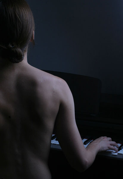
Wow! This is simply wonderful and rates very high of being different. This kind of creativity is rare as DPC ruins you with steriotype thinking :) I really like the choice of subject, the message being communicated and the cropping of the photo. The only thing which I might like here is bit more of highlightes. I'd still like it to be lowkey, but a bit more of contrast will enhance the curves and contours on wonderful body. Lovely photo.
I don't understand voting! This is one of the best images. I'm reading 'Communication Arts' Photography Annual 46 and this image reminds me of something I would see in it. People may be right when they say a little more white on the piano keys-but not too much. Maybe you could experiment with turning the piano a bit so the lines are perpendicular to her beautiful upright form. By the way, whoever she is she has a beautiful back and shoulders. / end of essay
I like the composition of the photo, but for my taste it's a bit on the dark side. If there was a greater contrast or a bit more light I would have scored it higher.
I know it's suppose to be moonlight but maybe if the keys could have been made a tad brighter it would have taken the focus away from the center (i.e. her shoulder). Another thing is the background doesn't fully blend in with the piano and thus creates a bit of a distraction with the sharp line it creates.
Very nice. A little bit more light would work even better; also, the model should be better positioned in relation to the keyboard (turned to the right a bit). As such, it looks not so natural. But a great pic anyway.
Great idea but I think your lighting has let you down a little. I'm sure this shot was very different in your mind? The WB is slightly off and this is, unfortunately far too dark. Compositionally I would have maybe done things a little differently as well, not as much of a close crop and with the piano perpindicular to the body, if you know what I mean.
If I were you I'd persist and persist in reshooting this because I think this is a fantastic idea, good luck! :)
When I first viewed this there were four spots of dust on my laptop monitor that looked like the Southern Cross and gave her something to look at. That said, this is a wonderful photograph.
I find this a compelling composition, but there's just a bit too much "darkness" to it and not enough mood. I know perhaps the attempt is to hint at the subject being moonlit, but for me, the woman just blends in a bit too much into the background, and perhaps the image could benefit from a change in contrast value. 7 for the idea.





 Add photograph to your favorites
 Add photographer to your favorites

 Photographer found comment helpful.


