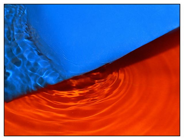
Composition: This is a very well composed abstract photo. I like the diagonal line formed by the two colors and the curves developed by the ripples of water. The water ripples add wonderful texture and interest to the picture.
Technical: I feel that your focus, exposure and use of light are right on. Your post processing is clean and it appears that the colors are true and vivid. Your simplistic border fits the picture well.
Challenge: You have met the challenge with not only a picture that included complimentary colors but one that is interesting and pleasing to the eye.
Suggestions: I have studied this picture and the comments left by others. The color might be a little more orange but I think this is nit picking. You have controlled the light very well with no harsh spots, a technical part that I wish I could master as well as you have. I find no need for improvement other than it could use a little sparkle to liven it up a bit. I don't know exactly how you would accomplish that, so I hated to mention it. Maybe you could have let some of the light bounce back, but not so much as to create hot spots.
Disclaimer:
Bear in mind that I am here to learn, just as many others and any comments that I have made are not intended to be offensive in any way, and are only constructive criticisms. If you wish to comment or discuss this critique please feel free to do so at any time.
Thank you,
Dick Pattee (Autool)
Autool@attbi.com
Shots like this always amaze me, which, er, is partly because I'm very ignorant (not stupid, just ignorant). But still, nice, though I think I would have gone with a more yellow second colour to really get the contrast of the complementary colours -- this has a bit too much red in.
Good use of complementry colors. I really like the water ripple effect. It makes the picture interesting. At first, I didn't like the shadow, but as I study it further, I change my mind. It add dimension to it. The colors are vivid. Good job! 10







 Add photograph to your favorites
 Add photographer to your favorites

 Photographer found comment helpful.


