Challenge:Nude III (Advanced Editing IV) Camera:Sony DSC-F828 Location: Emerald Queensland Australia Date: Aug 15, 2005 Aperture: F8 ISO: 64 Shutter: 1/320 Galleries:Nude, Studio Date Uploaded: Aug 15, 2005
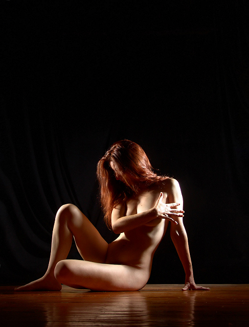
I was away for this challenge but this would have been a ten for me. I love the complementary colours which is highlighted by the intense light. The camera angle is perfect the only dissapointment is not seeing a little more of your face although it does add some intrigue, well done in such a hard challenge and congrats on doing a self portriat
You're welsome Judy :) This was one of the few 10s I gave out. The lighting is great except for a few areas that have already been pointed out. I do like the sense of anonymity in this image. Great job and congrats on your top 15!
Interesting pose and great reflection. The dual side lighting is a great idea, but I would have much preferred more diffuse lights for more graduated shadows. Also the backdrop is a bit to noticeable. 7
Very nice pose. A slight reduction of light to avoid the birnout would have made this a top contender. Not all is lost, the composition and color hold enough appeal. Bumping up.
this is really great, lovely model, pose, and staging. two nitpicks-
1. hot spots on right hand and left shoulder.
2. the right arm is placed where it is for obvious reasons, but the placement nonetheless looks awkward.
I would have left out the negative space. I think the composition of the pose would have made a good compositional shot. I like the tonal range and it would have been enhanced better if it was zoomed in closer. (8)
This is very nicely done, the only thing that niggles is that if the model had pointe dher right foot i.e. toe to the floor it would have made a better line with her leg. Sligtly over exposed on the RHS (her left) great composition.
the rest of her looks pretty beautiful, too! A bit heavy on the dark, negative space. I think less may have been more. Otherwise fantastic. Great light, pose and model, good use of color, similar tones in hair and floor. Reflecion in the wood looks good, too. At least top ten, if my taste is any indication for where this should end up.
I like the overall lighting on this shot, perhaps I would have softened it on her hand and shoulder. It a small thing, otherwise a lovely shot. Good luck.
Hello, I came back to comment on this photo. I love it. I really like the composition of the photo and the negative space. I hope this does well. I also wanted to tell you that if this is a self portrait, I admire you for doing this and submitting it. Great job.
The shadows and general lighting set up is nice. The hand is overexposed and, imo, it detracts a lot from the quality of the picture since her hand is an important part of the composition. There is good separation between the model and the background and the picture is nicely in focus. Good job. bumping up.
nice use of the light source...would like to see what this pic would look like without all the black area at the top...in horizontal as opposed to vertical...7
Very nice composition. I like the pose very much, and I think you've used negative space to enhance the presentation nicely. The lighting is very good and dramatic, with the exception of to me it seems like just a wee bit harsh on the right hand and upper left arm, but like I said, just a wee bit, only a very minor distraction to me. Very nice job.
Very nicely posed and lighted. The color of the floor balances nicely with the color of the models hair. I would have liked to see the supporting arm a little more to the right to recline the model slightly more but without seeing a shot this way, I am not sure if would help the image. 10 and to my favorites
well conceived. The dual light source works effectivel. The tones are excellent. Not too sure about the negative space but it works okay. Composition/position of the model good. Like that you left some draping in the background. 8 -Good luck in the challenge!
Next thing to perfect. Should sell easily, but I believe I would crop out some of the ceiling. Light , colors, pose is all fantastic. Great photo. Deserves a 10 today.
Well executed, nicely photographed nude. Skin color is very nice. Color of the wooden floor is distracting to me (too orangy), but that's my personal preference. Nice pose; could have been better with pointy foot to stretch those leg muscles. Same for her left hand (could point her fingers nistead of putting flat hand on floor). Very nice lighting. This shot would work very well in b&w or sepia. Nice choice of model. If I am to be picky, I'd say it's too bad the hand and left arm are blown out like that, detracts from the softness of this shot. Good job! 7
Some minor things. I think the backround could have been burned out to remove the slight folds in the fabric. You really can only see them on the left side and I'd like it to be consistant. I like the choice of floor, but watch out for splinters! Her hand doesn't look natural, she looks like she's forcing it open. I also might suggest putting her head in the upper right corner and leaving out more of the black backround and adding to the left side of the photo. 7.
I love this shot. I wish I had a room that I could do a similar shot with. I really like that the background is visible in places. I think that her arm, and hand are a bit blown out, and her hand seems a bit forced. However, the hair is just about the same color as the floor, and that is kinda cool.
Good lighting. Good shadows. I like the hardwood floor, it adds an interesting texture to reflections. The hand seems a little bright. I like the pose. Good crop and use of black bg hightlight the model. Well done.
Quite a beautiful young woman. I love the fact that the color of the floor in front of her is very nearly the color of her hair, it complements her wonderfully. Great lighting.
The only nitpick I have is that the floor behind her looks kind of washed out. I would have preferred to see the black draped all the way up to her rear end, or to see the same "richness" in the floor that I see in the foreground. Don't fret about my "nitpicking" though, I gave you a 10.
In my opinion, this image would be stronger with less negative space at the top. In fact, if it were mine, I would crop it to a landscape orientation. I'm a bit bothered, too, by the stiffness and seeming awkwardness of the splayed hand at the end of the arm crossing the model's chest.
A pretty professional looking shot. I like the pose & the wood floor/backdrop combo. the light seems just a wee tad hard on the hand, but I'm just grabbing at something picky to say. [10]
1. I would crop all that negative space up top.
2. The lighting on her arm is very harsh, causing the highlights to blow out. It detracts from the photo. A very beautiful woman here and my eyes go to her arm because it is so bright.
3. Her pose would be great if her arm wasnt shielding her breasts. It makes the pose awkward and unsettling.
I do love the fact that her hair and the floor are close in color, it helps the photo.
I kept coming back to this shot. I don't know if it is the red hair, the soft curves or the movement in the right hand which conveys a sudden reaction to something that draws me back. Since it is so moving I decided to boost my vote to a 10. Thanks for sharing this with us.
The lighting and composition are lovely. I find the bright light on the flat surface of the right hand a bit distracting. If the hand was rotated so the side was facing the camera, this bright surface would be reduced
the Good Doctor is here with another great image. Magniciantly dramatic lighting. Great detail in the hair, the ability to see individual hairs, and shadows with detail, all staged on a beautiful wooden floor which helps capture and reflect the skin tones and beautiful red hair of this goureous model. The hand and shoulder seem just a tad 'hot'. Otherwise an extremely stunning image and another addition to my favorites!!! Great job. <9>
I would have lost a bit of the black at the top of the frame, but this is a beautiful shot, only thing I would change is the hot spot on her arm and hand but I know that is easier siad than done LOL. Also if her hand were a bit more relaxed? Good luck
wonderful classy image here. only one nit pick and thats the one light is too harsh on the models hand. i love how the color of her hair is mimicked int he stage(?) floor. very nicely done
This must be it - blue ribbon winner. I haven't seen a better image in this challenge yet, nothing comes close to it. Lighting, composition, appeal of the imagery with a lot left for imagination... just perfect.
Great pose - and this model is well suited to nudes. I enjoy the backlight brighting her hair, the light is a little harsh on the back of her hand and her arm. Very nice.
I like this shot a lot. I like how the brown of the floor and her hair match. Interesting lighting, though maybe softening the light from the right would improve it a little and remove the blowouts on her hand and shoulder.
Exquisite use of light and dark. I'm glad it's in color, with her beautiful red hair. The shadows and contours against the hard wood (play on words, eh?) is just excellent. I like your vast use of negative space.






 Add photograph to your favorites
 Add photographer to your favorites

 Photographer found comment helpful.


