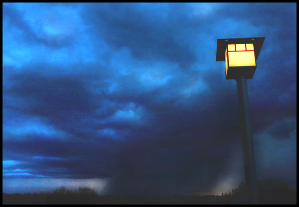
i would work on the contrast for this image... is it possible to straighten out the light pole so that it doesn't appear that it's tilting? i'm not sure if that is legal in this challenge... 5
Great idea and composition, but difficult lighting. I don't know if careful curve/level adjustment could solve this problem, but the lack of dark tones really bothers me (and the black frame makes it even more obvious that there isn't any pure black in the image).
There's an odd, almost water-colour-esque feel to this image (not out of place, I suppose). I can see arguments both for and against the inclusion of the lamp-post, but oh, for it to be straight. Colour tones are good, and the sense of greyness, of dullness is well achieved. Without the post, it might have an almost turner-like quality of light about it.






 Add photograph to your favorites
 Add photographer to your favorites


 Photographer found comment helpful.


