Challenge:Rain (Advanced Editing IV) Camera:Nikon D70 Location: new york city Date: Aug 14, 2005 Aperture: F/4.5 ISO: 1600 Shutter: 1/10 Date Uploaded: Aug 14, 2005
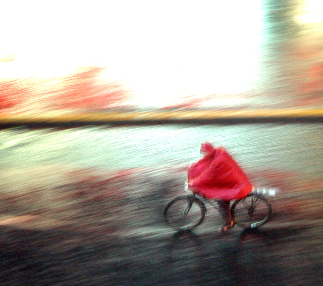
large rain storm in nyc sunday evening. was panning cars, buses, pedestrians, and this delivery guy goes by. looks like i did a ton of editing but only adjusted levels, contrast, and brightness.
Statistics
Place: 46 out of 228 Avg (all users): 6.0164 Avg (commenters): 7.7317 Avg (participants): 5.6748 Avg (non-participants): 6.2486 Views since voting: 1087 Views during voting: 513 Votes: 304 Comments: 45 Favorites: 5 (view)
I really do like it, but I wish the washed out top could be fixed. The effect is really nice. If you resized it and cut off the top just above the brown line. But that is just what I would do. I still like it.
I avoid putting editing techniques in a title. I like this shot a lot, it would make a great poster. IMO, it's very sellable, congrats on creating a great piece of art!
edit - picking this as a top ten finisher, good luck!
The massive highlight in the top detracts from this excellent image. Perhaps a wider angled crop to minimize that area would have upped the score. Still, an 8.
I like the Monet-esque feel to this photo. The colors are great, unfortunate that the upper part is blown out, but that may just add to the image. Well done.
This has great potential in it and I love the motion that comes along with the image. If there was one thing I would suggest to change is the overblown highlights on the upper third of the image. 6
Nice image - and the kind of title I would expect to put folks' backs up. I'm not sure, for myself, and given the rule-set, that the process of your editing is much of an issue in my assessment of this - at least, it wasn't until I read the title.
Nice photograph. Basic editing rules ... why? Or more to the point, why say so? Do you imagine that makes it more meritorious? It's a fine image, and doesn't need to be boosted or rationalised to score well. Terrific composition, well captured and effectively (if a little basically) processed. 8
I like this a lot. The only suggestion I have is that you might consider playing with the framing and going to a horizontal crop, cropping as much of the white at the top as possible. I think that would make it a lot stronger.
As I type this I am still staring at this wonderful image and enjoying it so. The color is wonderful and the context portrays the rush of movement as we all run (or ride our bikes) to avoid getting wet in a sudden shower. Love it. I also wanted you to know it is the only picture I gave a 10.
The image is nice but the title is REALLY unneccesary. It's irrelevent and "Delivery Boy" would have been just fine. Anyway, I like the image. I would have cropped just a little off the top as that much white space is a little over-powering. Looks like colored pencil filter was used. Whether it was or not, the feel/texture really enhances the image. I like the repetition of red here as well as the soft focus - it works with the image. 8 - good luck in the challenge! Update: In looking over the rest of the entries, I came to realize this was one of the more creative shots and so I feel compelled to bump you up to 9.
I really like this..the movement, the color and light...it has a really interesting abstract appeal...I not sure I get "(shot under basic editing rules)" in the title, does it really matter? Maybe you're afraid of getting marked down for "overprocessing" the image? Sometimes I wish DPC would atleast give us one line for a brief description or thought...not just a title...anyway...I'm rambling now...a really nice image.






 Add photograph to your favorites
 Add photographer to your favorites

 Photographer found comment helpful.


