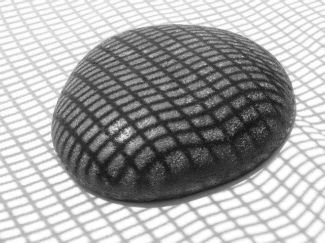
Very fun. The only thing that looks a little "off" to me is the way the grid shadow at the bottom of the screen looks wavy while the rest of it is relatively straight. While I like the centered image, did you try any other compositions? I'm curious to see how it would look off center.
Nice, simple, effective - a very good shot for b&w. I've been trying to play around with the crop to move the stone off center, but I don't like any of those variations, yours is better.
A very interesting concept. It's odd that the grid lines are contoured on the white background in the lower right hand corner, which detracts a bit from the effect, to me.
Well done. I like the tonal range. The whte seems to be just a few % below the highlight on the rock. I the composition would feel better for me with a bit more space on the left and the top, right a bottom equal. (bottom is a bit too much.) Another alternative would be more space at the top with right and bottom equal. One criterian I use for B&W is if I would rather see the image with color. This image passes that test easilly, color would be a distraction.







 Add photograph to your favorites
 Add photographer to your favorites


