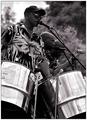
nice clarity. to me the composition just feels cut off. as the top of the sax leads my eye to the bottom of the frame. i think it would have been nice to include the sax as it's curve would have allowed the eye to move around the image alot more
The horizon seems to be at just the wrong place, I'd have got slightly higher or lower to maximise the position of the background. Tough exposure, the face seems slightly too dark but I understand you'd be in danger of blowing the highlights if you'd let more light in. Still, I'm sure there's something more that could have been done with curves. I'd also have desaturated some red to make his skin tone more flattering. What's the streak at the top left corner of the shot? Composition feels slightly unbalanced, I think we need a little more sax.
ah...really nice bold colors. left side of frame background a bit distracting with the intersecting faded lines, but what can you do under basic edit, i suppose. nice image. 7







 Add photograph to your favorites
 Add photographer to your favorites


 Photographer found comment helpful.


