*Critique Club*
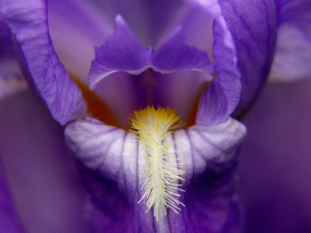
I really love the colors. Definately fits with the challenge.
The only thing that I can see that might improve this shot in my opinion is if it were a bit more symetrical. I like symetry for the most part, and the way this shot is, I feel like I'm leaning to the right a bit.
The hovering piece of flower above the yellow part is really fascinating. I find myself staring at it quite a bit.
The focus and clarity of the purple part is great. Soft is good. I wish thought that the yellow part were just a bit sharper though. Still not bad at all, and the lack of super human crispness doesn't affect the shot bad at all, but would be a nice bonus.
The lighting for this was super. I think that was very important in getting the great color you show us here. Also I think that the detail is very appealing as well.
Great shot.
~Heather~
One of my favourites this week. Good composition and the colors are perfect. So is focus and the cropping. Meets the challenge very well. Well done and good luck!
Wow- this is a great photo that definately meets the challenge! I keep looking at this as there is really so much to see beyond the obvious. Excellent job - you must be very proud of this! Good luck in the challenge:)
Yup, flowers have definitely been a trend I didn't notice -- I didn't really skim the thumbs. Not your fault you're the third one I've come across. It meets the topic, and actually the closeup focus and the predonderance of one of the colours over the other is a very nice touch that does not duplicate the earlier efforts. And yes, it does rather look like an apropos title. I also note the hovering-butterfly effect above the yellow bits, which definitely makes the picture more interesting to me. If it was intentional, good job. (If not, good job anyhow!)
Very clever capture. I think you could have benefitted from an even tighter crop and still show the humor. A little more sharpening would help as well. -T
Lovely colours, good use of focus control, though I'd have liked to have seen the whole stamen (? - the white / yellow bit) in crisp focus and the rest of the flower as is. The soft light works well but perhaps some more back light through the flower would have made this even better ?
Seems to have a lot of potential as a portrait orientation too - as there seems to be more interesting details out of the top of the shot than is on the sides. (9) revised 10






 Add photograph to your favorites
 Add photographer to your favorites

 Photographer found comment helpful.


