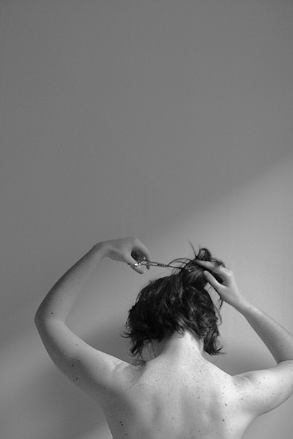
My friend suggested an alternate title should be "Calvin Klein Scissors" since it looked like a CK ad. I really need to stop taking self-portraits. The lighting is from the window, with the blinds pulled halfway up.
Statistics
Place: 43 out of 153 Avg (all users): 5.8821 Avg (commenters): 6.9000 Avg (participants): 5.9217 Avg (non-participants): 5.8473 Views since voting: 3103 Votes: 246 Comments: 35 Favorites: 20 (view)
i think that anyone that doesn't understand the use of negative space should have their camera taken away and be enrolled in a class on basic composition.
Oh dudes, it's really not that hard to cut your hair by yourself :)
I do have very tall windows (12 foot ceilings and 11 foot windows), but I was still crouched down a bit. I knew the cut-off elbow thing would get me in trouble. It was centered in the original shot, but I really wanted to use the 427x640 dimension, because it seemed to be more what I had in mind for the shot, probably because it's more the dimension of my windows than 480x640. I also wanted it to be off-center, so I decided to cut off the elbow slightly. Oh, I also flipped it horizontally so I could look like I was left handed. I was going for it to be something that was slightly 'off', to make people think "there's something wrong with that". Obviously, people did, but not quite in the way I had hoped :)
I wanted to go back and do it again with the hair clipping on the other shoulder where it might have shown up better, but I never got that light again last week (stupid rain).
I think this is very cool. I like the sharp slant of light/shadow and only wish it were a little bit more distinct (the shadow a little darker). It looks like there is some already cut hair on the left shoulder, but I can't quite tell -- I assume that's what it is, but I wish it were a tiny bit more obvious. Still very cool.
cool framing and almost cool lighting. i would have liked to see the light coming across the wall and her back and hand a little brighter and the background a little darker to add extra drama. *very* good and creative idea though!
I like the abstract framing, and the lighting, I would play with the tonal range a litle more thought, and a textured background may have been more interesting. Good use of black and white - 9
Must be the oddest framing job i've ever seen. I like the verticalness of it all, but cutting off her right elbow doesnt work for me -- I'd like to see her centered at the bottom. The lighting is pretty cool too.
I saw this on your pbase portfolio, and thought 'she'd better submit that'. Good eye for the light. I wish your right elbow were tucked into the frame. Took a while to see the clippings on your shouldesr, but they'd show on a print.
I like the light usage in this picture. I keep going back and forth as to all the open space above the subject. But, since I keep thinking about, I have to say that's it's a more engaging photo than I had thought at first glance.
Only suggestion I have is move to the left a little to get that other elbow in. Most will probably say crop some off the top. That was my first thought, but the more I looked at it.. the more I decided I like it better with it not cropped.
this is really great. perfect lighting, great contrasts, and that negative space is scrumptious. this might look neat on a lighter background to introduce a tad more contrast, but you'd lose that amazing light streak and that would be a shame. great work.
Great shot. I'm torn between two things tho and don't know which one would be better. I don't like the cut-off arm on the right. But moving more to the center of the photo would make it less appealing, too. I'm not sure what to do. Was it possible to take a landscape shot with you in the bottom right (including both elbows)? Anyway, good picture!
A touch too much empty space at the top and I wish the right elbow hadn't been cut off, though I think I can understand why you did. Very effective lighting.
Great lighting for this shot. I think there is just a bit too much dead space at the top. Maybe just 25% less. I really like this though, don't get me wrong.





 Add photograph to your favorites
 Add photographer to your favorites


