hi there from the CC club
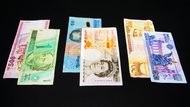
nice choice of subject for complementary colors ... certainly meets the challenge ... however i think if the colors were more vibrant or more "in your face" the image in a whole would have scored higher.
the composition works well here .. the staggered currancy with the appropriate complementary colors against the black background and the detail in the money is well executed. I think this is a nice original idea - but if you focused in on one pair i think it may have given it a more impact on the viewer .. keep up the good work ... ayme
Hmm. On the one hand, yes, you do have some complementary colours there. On the other hand, the softness of some of the colours and the fact that non-complementary colours are set next to each other between the pairings detracts from the focus on the topic. Also, honestly, photographs of money don't do much for me. But it was an interesting idea.
You managed to incorporate all the complementary groups! I must say, the Queen looks so young. Nice how you got such a black background, that's difficult. Good job.
interesting documentary style photo... maybe photograping one pair of bills would have allowed you to bring out some more interesting detail and create a less literal view of the currency. = 4







 Add photograph to your favorites
 Add photographer to your favorites

 Photographer found comment helpful.


