*Critique Club*
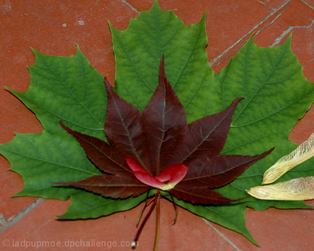
This fits the challenge nicely. The red/green combo is nice, and the idea is creative.
The lighting looks a bit muted, like the lighting conditions were not ideal for this shot. It does make this seem a bit flat and lacks the depth I think it needs to stand out at us. Not that there really IS much depth, but some sun or something (but not too harsh) would help in my opinion.
Also, the focus seems a bit soft. It seems that there is a sharper focus in the upper right hand corner, and then the rest is a bit soft. It is really obvious if you look at the cracks in the tiles.
I do also think that a different background might have helped out some too. With the texture (cracks) in the background, I think that they take away from the texture of the leaves. Creating a bit of a distraction. There is that one crack that cuts all the way through the leaves. going from the upper right to the lower left. Cutting objects in half, even if from 'behind' bothers me for some reason.
I think that the idea is good. Quite interesting, and effective. Just a few minor adjustments and this could be great.
Oh, I will also mention that the seeds are a distraction in my opinion as well. I think that with the total green/red theme, the little white/yellowish ones really stand out more than anything, and on top of the cracks in the tiles, really take away from the image.
~Heather~
I think, honestly, I would have preferred this without the floaters against the leaves. The colours of red leaf upon green upon the terra-cotta background would have quite sufficed and hit the topic spot-on. The floater additions distract and detract and make it look like you couldn't resist an arty touch that was wholly unnecessary. Mind you, it's a solid base idea and a good photo overall, despite my criticism.
this meets the challenge, but the light is a bit dull. The seeds on the left also create a bright area that detracts from the red/green combination and draw the eye away.
too many distractions - try it on a more neutral background - do you need both kinds of seed pod? Either keep more in the frame or less, like this it just looks cut off.






 Add photograph to your favorites
 Add photographer to your favorites

 Photographer found comment helpful.


