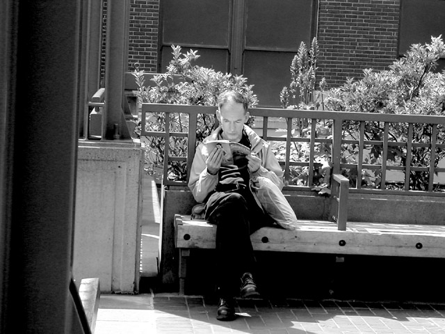
I think this either needs to be more drammatically tilted than it now is, or straightened so that it's level. The little bit of a tilt makes it feel like it's accidental and not intentional. I'd also suggest a slightly tighter crop, if possible, to remove the support post that's along the left side of the image. That would move your subject further to the left and make use of rule of thirds too.
The reflected light from the open book is perfect for lightening the shadows there. Good focus and clarity. Don't know if the black bit of architecture at L adds anything, and certianly needs a CCW rotation. I'd straighten the horizontals, then crop tighter on the man. Still nice.
This is a good shot but the black bar on the left side is distracting. If rotated and taken with the subject on the lower half this would of really done it for me. Still its a clean photo with nice tones and shades.
Nice, peaceful, contemplative shot. I like that it's slightly skewed, although some people are probably suggesting that's wrong. It makes it seem more candid.
I believe the blacks and whites contrast well, there's something about the tilt that bothers me and the fact that you almost lose the subject in all that's surrounding him. The black area to the left is bothersome to me as well.
I think cropping or framing it so that the pole-thing wasn't in it and moving the subject to the left would have made it more balanced. I kinda get the feeling you were hiding somewhere and were trying to take the shot without him seeing you.
This photo should definitely be re-framed to remove the dark strip from the left edge... that is accenting the tilt to the right on the camera quite a bit...





 Add photograph to your favorites
 Add photographer to your favorites


