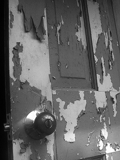
good choice of subject, with tons of texture. Almost feel a more 'face on' shot could have worked better ? Needs better light to highlight the peeling paint
I like the theme to this, but the black space on the left I think could've been left out. The glare on the door knob base is a bit distracting as well.
A nice subject for B/W, but the lighting and composition could be better. Given the limited dynamic range you have to work with, it probaby would have been better to concentrate on either the area in shade, or the area in sunlight, or the place where they intersect. The small sunlit area at bottom just steals potential contrast from the large shaded area as is.
NIce image, I would have given it a 10 if the composition were better. The slant seems careless rather than compositional. Nice tonal range with the highlight on the knob plate and the deep shadow behind the door. Composition would also have been helped with the door know a bit higher.







 Add photograph to your favorites
 Add photographer to your favorites


