Hi neighbour - you get to be my critique club victim {manic laugh}
There is no way that I'm saying anything 'technical' about this shot - as much as anyone else here I'm sure you shoot exactly what you want to shoot, and pretty sure it comes out exactly as you envisage it.
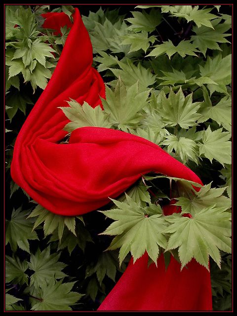
Complementary colours was a tricky challenge - especially right on the heels of those other colour challenges - I think a lot of people struggled for real inspiration: I thought the sane of this at first. Sure there's great accomplishment in the shot (the colour detail, the contrast, the shapes - more contrast there too - the light) but it was just a scarf in a tree, no?
Except with that title it brings an element of story into things: as somene else has commented below. 'Her'? But who is she, where is she? Why is her scarf in the tree? It's a little like wandering around the venue of a party the morning after, examining the wreckage whilst presumably nursing your hangover and a large bowl of coffee, wondering what the stories are behind the things that are forgotten, and how come there is so much you can't remember yourself.
Of course, I might just be getting sentimental. It might just be a scarf in a tree. But you could have titled it simply 'red silk scarf'.
For me it's just slightly too big a stretch of the imagination: I'd have to say that as much of my reaction is myown work, and not enough directed by your photograph. If you were telling a story, I think you'd need at least some extra element, perhaps a knocked over glass, or an empty botttle ... whatever, something. I've had fun thinking about it though.
Very nice! I love the contrast of the two elements. Composition is well balanced, you gave both elements enough weight. The red border spoils this wonderful image a bit imho. Very intelligent shot!
Technique: 3/4
Composition : 3/3
Originality/meeting the challenge: 2/3
Total = 8
Very nice color combination and even though a scarf isn't normally draped around a tree, it doesn't have a contrived feel. Could be a nice cover for a mystery novel. I do like the green leaves because they have this aura of surrealness because of their low saturation. Wonder whether you did that in photoshop? Nitpick: the only thing i would have eliminated somehow is the tips of a number of leaves on the left edge just above the scarf. 8
good use of complementary colors... the composition here is also nice... it leaves me asking what message is being sent by having a scarf in a tree :) = 6






 Add photograph to your favorites
 Add photographer to your favorites

 Photographer found comment helpful.


