It's all about "GLAM"!
The year my husband was conceived...1957.
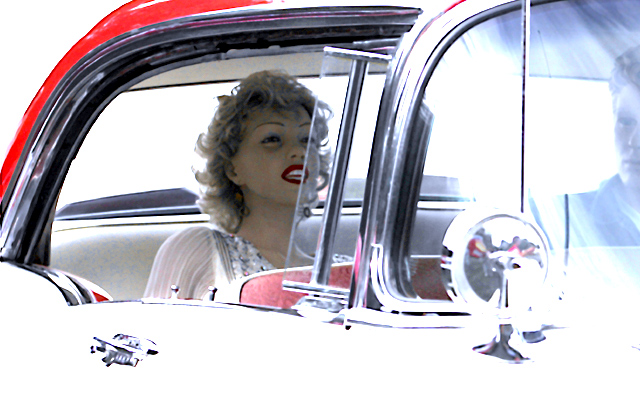
The year the car was made and sold...1957 Chevy.
Processed more than I have others, but it's only levels and hue/sat adjustments with some blur and some sharp (yes both at different stages)....resized and saved for web.
Interested to find out what y'all think about this one. (oh, and I >am< hoping for something above a 6...if that's not asking too much)
--
After challenge comments:
Taken at a the balloon rally after the balloons had launched. The owner of the car is quite the enthusiast since these are just 2 of 4 (or more) manequins he set up.
Exposure: Yes, it was dark inside the car so I started to play with levels. When I realized I would need more than "basic" editing to acheive a normal, well-balanced photo, I decided to see if I could go a different direction. I noticed that a combination of levels, hue/sat, and odd (to me) settings on the USM would bring out the graphic lines of the car.
I knew when I did it that it wasn't really "high-key" but I didn't care, I liked the effect I was getting.
I also know that the highlights are "blown" "over-exposed" "washed-out" and I intended that after I began experimenting within the editing rules. Consider this "deliberate over-exposure" if you will.
The "Guy": I could have easily cropped him out, so why didn't I? That section of the photo with it's cool blue tones adds balance to hot Marilyn and all her reds. I felt she needed the audience for her apparent giggle. I was looking for movie-screen like dimensions and there was nothing to the left.
The comments & score: I am absolutely floored by the 30 comments received during the challenge! THANK YOU, all! I had fun watching the score bop up and down all week--I've never seen such a yo-yo effect! It went everywhere from a 5.2 to a 6.0! Who knew where it would stop.
Statistics
Place: 48 out of 298 Avg (all users): 5.7367 Avg (commenters): 6.4615 Avg (participants): 5.4915 Avg (non-participants): 5.9141 Views since voting: 1623 Views during voting: 499 Votes: 281 Comments: 35 Favorites: 2 (view)
This image would make a very good high key image and has a good start to that end. However, I believe the transition between bright and dark areas of the image is way too harsh giving it the feel of overexposed rather than high key.
IMO, for high key to work all important detail should still be present with a nice even flow from bright to dark kind of like fading.
Good grief! I didn't vote in this challenge, but I am dismayed at the number of commentators who obviously feel that the 'blown' portions of this image (and any image, I suspect) are by definition 'bad photography'. Of course, people are entitled to be narrow-minded. But surely they should at least have the wit to recognise that the photographer clearly intended the effect in this case, and isn't now sitting reading their comments, slapping her forehead and saying, "What was I thinking ... how could I have missed that?".
very high key looking, but upon further study, perhaps you just cranked the levels to make the face show up? Her face is still underexposed. and why not crop a bit more on the right and lose the fellow? he does not add to the composition, but rather detracts from it.
6 - Good effort to capture the era for the Challenge (in my opinion, this shot put into a time capsule for this year captures it well - albeit 'highly stylized). Criticism; whilst I like the dummies - 'he' looks less real than 'her', so for me, detracts. So, in my opinion, either a blurring out more or a cropping out of him, would make this a better photograph in my opinion. I like the colors and the contrast, the lighting too, but just a tiny bit 'blown' (but I'm guessing that's what you were going for) in my opinion. Creative though, you went to a lot of trouble.
Damn! I really, really, really want to love this photo, (I still have a crush on Marilyn from when I was a kid) but the burned out parts on the car, windshield and mirror just aren't helping here. I get that you were going for a stylized shot but as mentioned before I think keeping the detail of the classic car would make this shot blow you away.
The stylization of this image is just great. I want to like it even more, but the post- processing is too much for me. The white is too bright (on the car and her teeth), the red of her lips is too red, and I am not sure if the blue I see around her eyes is eye shadow, effects of the processing, or just my eyes seeing things. 6






 Add photograph to your favorites
 Add photographer to your favorites

 Photographer found comment helpful.


