Author Thread
Post actions
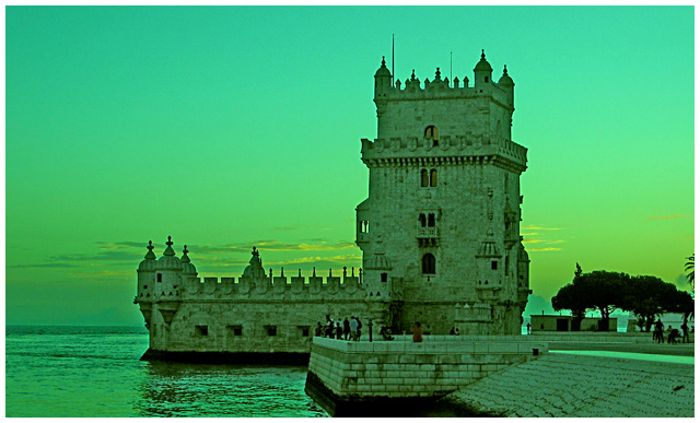
The tourists in modern clothing don't fit the time.Message edited by author 2005-08-17 19:40:58.
Comments Made During the Challenge
Post actions
i like the coloring in this one, i just wish the people weren't there....still a nice shot.
Post actions
I'm not sure i like the green tones here, but compositionally I think this could be a very strong image. 5
Post actions
The color seems a bit off...too green. Otherwise, a good shot!
Post actions
Wow! That's a lot of green.
Post actions
Love the emerald tones. This is an interesting take. I like it alot.
Post actions
too green, the "USM halo" is too obvious and detracts from the image, nice clouds in background
Post actions
4 - I like the concept but even at (in my opinion and interpretation of the Challenge, a photo of this put into a time capsule to depict the era for future generations) a little stretch I 'don't buy it' as a true depiction. Criticism; The people (tourists?) are way too distracting/detracting for me. The color treatment, while interesting, and has potential, doesn't work here in my opinion. Maybe if you had a different angle or, a different crop, blurred out the 'people', might have made this better in my opinion. That said, I would also like to see a lot more definition and detail on the castle, so perhaps closer with that sky as the backdrop, not sure. edit: typo/grammarMessage edited by author 2005-08-17 08:19:44.
Post actions
Get those darn tourists out of there. :)
Post actions
I really like the subject, but not the green hue.
Post actions
WOW, wonderfull photograph~!i love the green hue~! wonderfull~!
Post actions
The green hue doesn't really do this picture justice. I think a sepia tone or B&W would have been better.
Post actions
Picture is a little green for my taste but I like the setting.
Post actions
Perhaps it would look better at sunrise... the colours are a bit "weird" IMHO.
Post actions
Too bad people had to get in the way.
Post actions
Hey Portugal right? The green tone and the tourists don't help. Nice image in any case. 7
Post actions
very green even for1498 looks like LA in the 60's. Great subject for this challenge, better focus and a change in color choice would have been better IMO
Post actions
ugly colour cast to this - I'm guessing its intentional, but I don't understand why you chose green
Post actions
Post actions
i like the green 'plugin' i want it. please be so kind. thanx.7
Post actions
Post actions
this is my favorite one!! i love the green colors!
Post actions







 Add photograph to your favorites
 Add photographer to your favorites

 Photographer found comment helpful.


