Your entry meets the challenge without any problems.
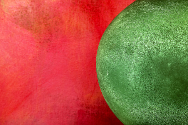
Colour / lighting: The colours are beautiful, especially the green. IMO it's hard to get a good green with many digital cameras, and yours is rich and bright without overpowering. Light also is very good. There is a real sense of dimension (depth) to this picture, even though there is not a readily discernible object. I like the textures throughout the picture, but in particular the texture of the red painting detail.
Focus: No problems that I can see. The painting is somewhat out of focus, but that works here.
Composition: I have more problems with your entry here; I would have never known that this was a painting by Bonnie Kline and a Murano glass pitcher if it weren't for your comments. I think it is perfectly allright to take a picture where what's in it will most likely not be recognised, but IMHO one would have to be very careful to somehow draw the viewers attention to something in the photo, to keep their interest, so that the picture is not dismissed as another "what is this?". I think another route in abstract shots is to work so that the viewer is allowed to see what it is without showing what it is.
I think that in a contest where viewers are voting on quite a number of pictures this "what is it?" becomes an issue. Your picture is clear and good to look at, but, again IMO, there really isn't much there to hold too many people's attention for a long time.
Overall: It's a good entry for this challenge, but it does not inspire the imagination enough to be a really good shot.
I'd like to say that you have some interesting picture in your portfolio. I like the architecture shots the best, they have strong lines and good colour. Is there a way that you can post larger pictures? The shots in your portfolio are quite small.
Take care,
Ursula (uabresch)
Comments, complaints, questions ... feel free to contact me
I like this very much. The colors are very clear and the structure of the ball-shape ads more interest and depth to the picture. This image is an example of how simplicity works for an image, and of how much there reálly is to see in an image that looks simple at first site. I hope it scores well. Regards, Marco.
funny title, good complimentary colours and interesting textures, particularly on the green object (melons ?) The red textures seem either over saturated or slightly out of focus which detracts - I'd like to see more texture in that part of the scene.
interesting abstract and excellent use of complementary colors. it looks like some sort of modern art painting to me... I like the simple elegance in this image... The title leaves me with questions... = 7





 Add photograph to your favorites
 Add photographer to your favorites


 Photographer found comment helpful.


