I really like the simplicity of this image but it doesn't really have a lot of appeal for me. maybe it would look better if you used the rule of thirds?
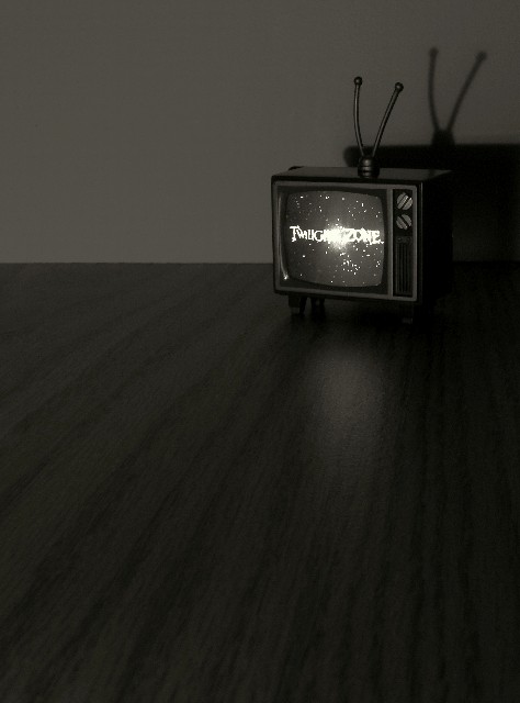
I really like the look of this ... sort of a Twilight Zone of the Twilight Zone. The broght spot on the centre of the Twilight Zone text is a bit of a distraction. Good fit into the chalenge.
7 - Met the Challenge (bit of a stretch in my opinion, but it is a 'mood' based one for me so a 'pass' in my books). Criticism; Whilst I like the 'bareness' and the focus on the 'twilight zone on tv', the grain of the 'floor' overpowers the setting in my opinion. For me, if you had a little rug or something it may have made this a better photograph, but seeing as that is a 'toy tv' (?) hard to find a rug that small. I like the shadow effect and I just think you have captured a little of the 'feel' of that time/era, even in the 'little set'.
I like the composition and use of the shadows. With the center of the screen wasn't quite so blown out. I especially like the use of the Rabbit ears! :)
I love this pic and think it is very creative. I'm giving it a solid 9, with only 1 point taken off because of the slight light reflection in the middle of the screen. Good job.
I was there. That is what it looked like, Get out of my head,
This is a favortie of mine. So many bad entries in this challenge,it is great to see some imagination. well done.






 Add photograph to your favorites
 Add photographer to your favorites


 Photographer found comment helpful.


