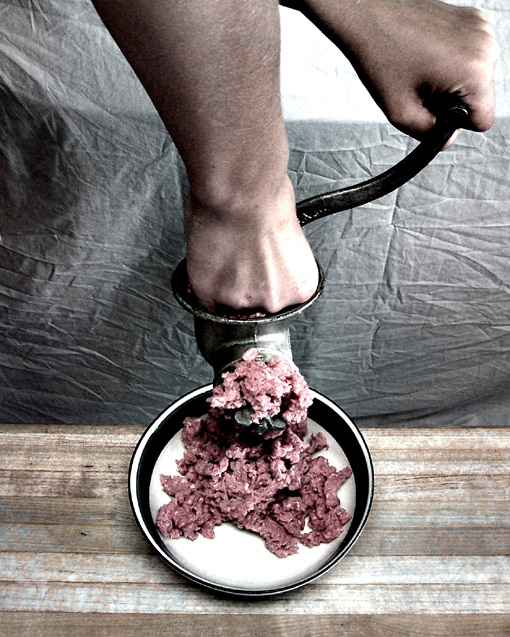
I actually really like the neutral saturation of this pic. I think it goes well with the slightly horror feel. I don't really like the wrinkly sheet in the back.
I think the lighting is good, but too harsh. It would be nice if there was just a little less shadow on the dark side and a little less blowing out in the brights. That's the trick with digital they say...
I think this is a super idea. Did you try to see if she could have angled her hand to get her whole hand hidden, appearing as though her hand was up to her wrist?
Even still, I think the pic itself is really good.
OMG, I made the top 50! This was a blast to shoot, I'd like to thank my wife for the great work sacrificing her fingers and all. HEHEHE, just kidding! I've learned from all the great comments, THANK YOU ALL FOR MY TOP 50 FINISH!
Well, you get extra points for originality!
Great idea but the background does take away from the main point of the photo. A neutral black background might have gone a long way to improve the focus of the image! But good job overall! the illusion works!
Besides making my stomach twinge, this shot needs a bit of work. First off, your lighting is a bit unimaginative. Ya need some fill light coming from frame left. Also the drop cloth in the back is a little wrinkled if ya didn't notice. ;-) Your colors are what bother me the most though. They are very dull. Maybe play with the levels a little more to pull the color out of the image...
TC
Okay, we have one of those and we always fight at Thanksgiving on who get to crush the oranges, thanks to you, no more fighting on my part, this image will sit in the back of my mind and haunt me until the day I die!!!!!!!! Just kidding :) I think it's neat!!
Gross :) Concept is strong. Rendition is not. The highlights in the backdrop take away from the shot, as does the backdrop itself. You've blown out some highlights on the hands. The compostion would have beeen stronger with the plate placed on the left 1/3 line. This could have been accomplished with the crop. Also push for more detail in the focal points of the image. 4
The background and lighting is totally not working but the idea is great.... Damn.... That´s some nasty shit! Hope you rememberd to remove the finger nails;)
8
Shivers down my spine, very effective, the bones must have given you some trouble though, don't they always? The image is not very sharp, could do with more contrast and the meat looks white from a strong light source..
A little blur on the handle and left hand would suggest movement and add some believeability. Also, your background is very distracting becasue of the wrinkles and blown highlights. Fleshtones and wood appear dirty.
good portrayal of an illusion... at least, I hope it's an illusion! harsh lighting and high contrast work well here, though the white spot in the UR is distracting.
A truly disgusting and creative shot!! ;) Love the subdued tones. It would have been even better if the background wasn't wrinkled. Very good job though.
When!!
i have to say this also - iron the sheet if youre using ity as a backdrop. I would have dodged that little bit of meat between his middle knuckles so it really looked as if his hand was being ground rather than his fish pushing doen the chuck. Clever idea!
(Gross!!!!!!) That said, this is a neat idea and seems to be carried out pretty well. It just seems a bit lacking in color and clarity, and is a bit grainy, but all in all, it is a neat illusion.
Ewww...visually disturbing, but fairly good illusion. Seems a bit too much ground "meet" than what just fingers could produce. I'm not too crazy about the background and the harsh lighting at the top right of the picture. Perhaps using a completely blacked out surface and background would have been better.
Yuck. That being said, I don't think the desated tones work here. I get the illusion and myabe you were trying to be less gross by doing this, but honestly the full color would have made more of an impact. Not my cup of tea but not a bad shot.
This is terribly frightening, I think I'll have nightmares tonight. It's a great idea. It looks like the lighting set-up has caused a couple of blownout spots. If you use a lamp I'd try to diffuse it a bit.





 Add photograph to your favorites
 Add photographer to your favorites

 Photographer found comment helpful.


