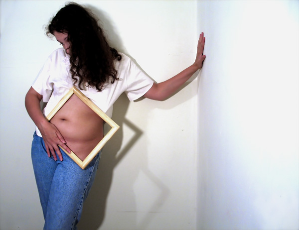
Demin was harmed in the making of this image bwahahah!
first members challenge - not too sure on the advanced editting rules, did some cloning that although was small did help the illusion out in a big way so...
better to have tried and been dq'd than to never tried at all, right?
Look forward to the comments on the bloated belly (been eating WAY too much leftover pizza)
Statistics
Place: 28 out of 127 Avg (all users): 6.1474 Avg (commenters): 6.4286 Avg (participants): 5.8837 Avg (non-participants): 6.2613 Views since voting: 14907 Views during voting: 1014 Votes: 285 Comments: 42 Favorites: 4 (view)
well this *just* made my highest shot ever - JUST but a good start for my first members challenge.
I am disappointed how many people wanted no shadow - the shadow makes the illusion. Thanks to Kevrobertson, Artan and Scud for spending enough time on the image to realise the reason the shadows were there.
I love the HP commecial, but no that wasn't the inspiration, this is a take on an image i shot over a year ago. I have been singing "out of the frame" all week along with the song that matches up with my timecap challenge lol.
With only three minutes to spare I make it back to the only shot that I voted on during the challenge and didn't comment on right away. I wanted to see the rest of the pack and peruse this image a couple more times before commenting. This shot has soooooo much potentional and shos soo much creativity. However there are a couple of things that are lacking. Your lighitng is a little harsh and throws shadows that don't add to the shot. The lighting on the wall to the right isn't very even. Moving your lights around till it's more appealing is all I can say to try and improve it. I really like the overall concept. Just tweak it a little...
TC
Hang on. I have no idea how you did this.
At first i thought it was a picture in the frame. But looking at the shaddows it's not...
bumping up for fooling me.
a pretty neat take on the challenge. the lighting is a bit harsh on the right wall, and the shadow is a bit distracting. a different lighting setup, and different position, would help to improve this shot. Definitely a hair light, a background light to take out the shadow, and perhaps a light from the camera left.
Very original idea, it fits the challenge perfectly. My only critique is that it would have been a bit better if the lighting could have been altered to eleminate some of the shadows.
Pretty neat idea. Would like to have seen her hand away from the center of the frame though, maybe more on the edge. Did you try this shot with the frame centered?
Nice idea and cleverly done... could do with a touch more finesse on the stapling of the blouse to the frame - the stretch gives it away but... the illusion does hold for the first moment of viewing. I also like the compposition too and the way her hair hides her face so the focus is on the body.
clever idea, at first I though it was photo in th frame untill I saw the shadow and realised the frame was emply. To lift this from a good image to a great image, I feel that some additional liighting is required to bring out the shot more.
good posing. the manipulation of the shirt looks a little awkward on the top right, though the pants are treated quite nicely. lighting could have used some work - something a bit more diffuse would have perhaps helped.
Interesting shot. I like the concept. A lot of the washed out wall on the far right doesn't really contribute, and the multiple shadows are distracting. I want that frame though hehe. Could be usefull!
Very well done! I really mean that!
How did you do it, I mean, there's only the shadow for the frame, and not for the picture on it, just like if there was nothing there!





 Add photograph to your favorites
 Add photographer to your favorites

 Photographer found comment helpful.


