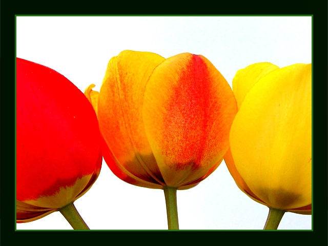
I really like this photo - the concept is really good and I like the composition. The only thing I would change is the border - just my opinion, but I don't like the thin green edge - think it would be better with just one color (but I didn't deduct from your score for that). Overall a very nice photo to look at!
you forgot to add a complementary colour. Also, the border is too thick and an oppressive colour. Try something more delicate to accent your picture, not overpower it.
Mmmm, uh... was this meant for one of the other challenges? It seems more like it belongs in the 'secondary colours' one. Not really much in the way of complementary here (some green vs red, though).
technically fantastic...dreadful border imo. your focus is great and your lighting is great and the colors are great. i thought there was supposed to be a complementary color for the orange here...7, but get a better border
Nice picture. The tulips are clear, and the colour is beautiful. The mattin is a bit heavy for my taste. A bit weak on "complementary" colour. Are the stems and green inner border it?
very interesting composition, but the exposure on the red and yellow seem a little hot... I also think this photo is not a great example of complementary colors... 'orange' is a complementary color, but it's complementary color of blue is not available in the shot... = 5







 Add photograph to your favorites
 Add photographer to your favorites


 Photographer found comment helpful.


