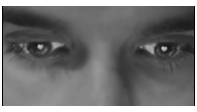
Technical: Image looks blurry, beyond soft focus. LIghting looks to be coming from the left as a deep shadow rakes across the bridge of the nose. The image itself looks a bit flat. Might have tried a little selective desat, leaving the eyes their true color. Would have given it a nice pop.
Composition: Feels too tight - but to keep focus on the hearts in the eys I'm sure you needed to keep it close.
Creativity; I like the creativity here. The message is sent with the title however - without it the meaning might be lost.
This is an awesome shot right down to the soft focus. You do have some color banding though from what I would guess was resizing. Did you make this bigger from a small crop? The only thing that I don't like is your uneven border. I think that this shot would stand alone much better without it...
TC
Wonderful highlights. I'd love to see the eyes much more in focus. The lighting is leaving a dark patch next to the nose that is strange. It has alot of potential. 5
Rated this a 3 my first time through because I did not see the connection to theme. Upon closer inspection I see what you were trying to accompliosh so I'm bumping you up to a 5.
The whole photo appears soft to me, not sure if that is what you were trying to accomplish or not. I personally would have rather seen the eyes and catch lights be much sharper. Had that been the case I think I would have voted this about a 7.
The idea is not new but the execution is excellent. I would prefer a slightly tstronger focus on the face.
I am also not sure about the border either. HOwever the end result is still a very competant and interesting image.
It took me a while to see what it is about this photo that makes it an illusion, then I finally spotted it. Nicely done, although I'm not sure about the direction that the model is looking in.
I like the illusion. On the thumbnail it looks better, but full size it looks unreasonably soft. Especially the eyes. I think they should have been sharper for more impact, but that's just me.





 Add photograph to your favorites
 Add photographer to your favorites


 Photographer found comment helpful.


