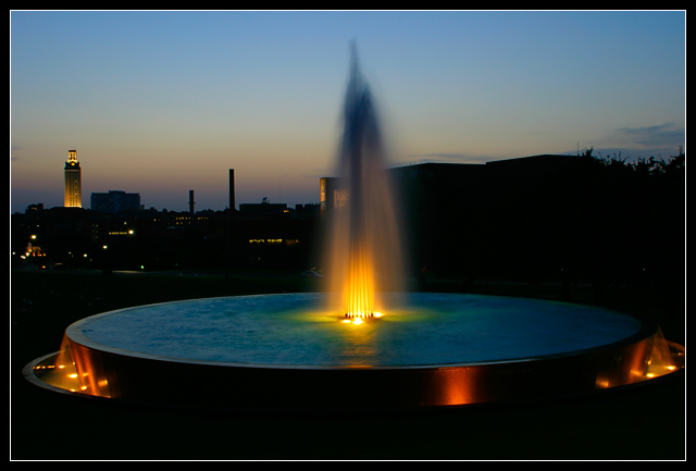
This shot came from one of the shots i did for the America 24-7 project. This is one of the outtakes as i would not show the one i submitted to anyone at the moment (notice how this image is SLIGHTLY uneven in that the fountain is slightly cropped on the right. The image i submitted to the project do not have this issue :P and was taken at a different angle)
The idea for the shot was to get the fountain and the UT tower together, and since the water and the tower has light orange lights, which signifies the UT color (Orange), decided to do a shot with the water fountain balanced and let the light complement the bluishness in the water (there are still sunlight left). The image is probably underexposed by 1/2 to 1 stop to get that extra saturation and darkness. Taken just after sunset (about 10 minutes after)
Technical Mumbo Jumbo:
Canon 10D
Adobe Colorspace
Cloudy/Shady color balance used to get more warmer tones.
Contrast not adjusted, saturation increased for that Velvia look.
Sharpened very lightly.
20-35mm lens used at 26 mm. Long exposure, mirror lockup used to avoid shake, self timer, tripod, and the willingness to stand in 95 F heat with bugs biting my legs.
Statistics
Place: 14 out of 82 Avg (all users): 6.2661 Avg (commenters): 7.3125 Avg (participants): 6.2321 Avg (non-participants): 6.3019 Views since voting: 1258 Votes: 109 Comments: 17 Favorites: 0
One of my favourites this week. Good composition and the colors are perfect. So is focus and the cropping. Meets the challenge very well. Well done and good luck!
It's nice to see several pairings of complementary colours in this: the focal point, of course, with the light against the water, but also the orangey tone to the lights around the fountain, the yellow-and-blue sky, and the yellow-lit building against the sky. Plus it's a nice twilight shot of a fountain.
This is a nice picture with the fountain centered, but because of the building in the background, I think it would work a touch better to have the fountain more in the right of the frame with teh tall building balancing it on the left. Right now, it feels a little unbalanced to me because there are lights and buildings, etc on the left, but just darkness adn what looks like trees on the right.
I like this but something isn't quite right and can't seem to put my finger on it.Perhaps the composition with the waterspout dead center.However,it is a beautiful photo.=6
Just wondering: have i seen that fountain, and those towers as a matter of fact, before? Like the subdued colors of the evening sky, seemed to have some LA smog. Colors are very rich and warm. The left half of the image is superb because it has a wonderful composition with the towers and the dispersion of lights. The right half is a bit dark because of the dark building sitting there without any further height differences. Could you have taken it standing to the right of this fountain, just focusing on the left half of the scene here? Just a nitpick and my opinion: that 1 px white border might have looked better if it had been the yellow-gold in the tower. That white doesn't appear anywhere in the image and it's so commonplace. 8
I like the left hand 2/3rds of ths shot - but right hand side doesn't add a whole lot. The fountain is really centered and makes the UT tower seem like an afterthought/ background clutter. The colours work well though they are quite subtle. Almost feel it would look better if you took it 5 yards to the right, so that the fountain was against the sky, rather than merging with the buildings and hiding the reflections there , but I don't know what else is around there then.
Did you have to turn up the blue a little in this one to get the water to be so blue? You've got orange and blue, red and green. And, if you count the horizon as purple, I'm seeing yellow and purple. I love it. I think that it needs to be just a little more centered or a little more off-centered. It's just enough to be distracting.
Nice lighting, I would like to see a tighter shot where the fountain is the main part of the shot. As it is now, the surrounding buildings makes the shot feel cluttered. 8 -danny
nice long exposure... the complementary colors are apparent, but they don't seem to be the theme of the shot or enhance the shot in any way. I think there are probably a lot of good composition opportunities of this scene with just the fountain... = 6




 Add photograph to your favorites
 Add photographer to your favorites


 Photographer found comment helpful.


