*Critique Club*
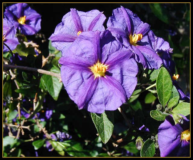
The color is very nice, but I'm wondering if you could have gotten a different lighting and still gotten the good color.
The lighting, which I'm assuming is natural lighting is greating some harsh shadows in the background, and on the leaves.
The agle and framing/cropping are ok. I would mention though that maybe it's a little unballanced by the flowers being at the top, and one in the bottom right, but lots of blank in the bottom left.
I might have cropped this to just below the bigger main flower.
Focus and clarity are really pretty good. There is some blurr in the background to help the main subject stand out a bit better, and there is really good detail in the flowers themselves.
I'm not really sure if I like the orange in the border or not. it doesn't look really BAD, but not quite sure that it really does much to help either.
Keep clicking!
~Heather~ |





 Add photograph to your favorites
 Add photographer to your favorites


