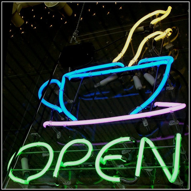
I like the composition you chose here... the square crop you chose seems to work very well in isolating your subject...
One of the things I particularly do like is the visibility of the detail behind the neon sign. It's muted enough that it's not obtrusive, but visible enough that it gives some good context to the photo. If those details were not visible, this would just look like a cartoon image or a photoshop rendering of a neon sign. Those visible details seem to keep this shot 'photographic' in nature. I have seen a lot of neon sign photos where nothing was visible except the color of the sign... I like the way this one turned out.
I think this shot would make a good 'product' photo in the neon sign industry. I have been fortunate enough to work with some sign makers in the past, and building neon signs is tough work. These people take pride in making a sign stand out like this and the inner workings of the sign is an art to them...
I know the critique below isn't very long, I'm going to ask a fellow CCer to have a look at this image also for a different perspective, and hopefully, some additional insights.
Initial thoughts Interesting content, nice crop, distracting bits and pieces…
Composition/ Content I like the contents – I think it’s an interesting detail to focus in on and I like the composition: text at bottom, slanting angle of the cup and negative space to top left corner.
IMO it’s a shame that the supporting structure to the neon tubes is so clearly visible and the white fairy lights at top left don’t add anything.
Neon colours are nicely captured, muted and appealing.
Fits The Challenge Yes
My Opinion On The Photo Attractive but not enough high interest.
For some strange reason I'm drawn to this sign ; )
Love the composition. I like the way it stays up one side without being shot straight on, very cleverly done.





 Add photograph to your favorites
 Add photographer to your favorites

 Photographer found comment helpful.


