Hi, Pep, I got another of your pictures to critique!
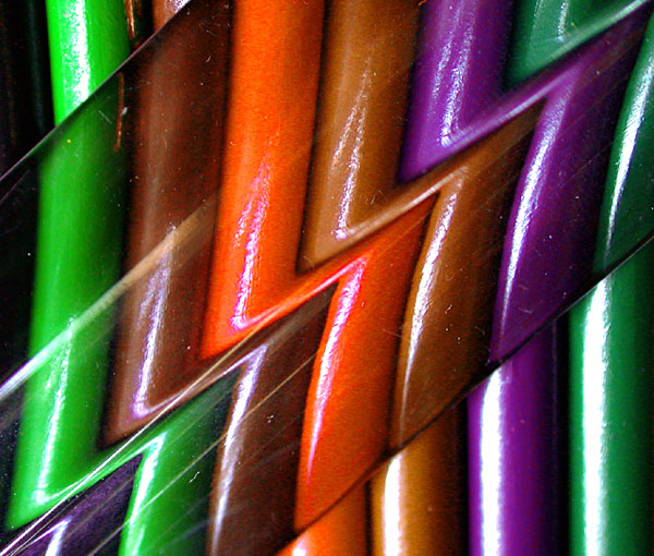
First impression: Interezting picture, meetz the challenge without problemz. I'm wondering what it is. Looks like coloured pencils (or straws) with some sort of glass or plastic (ruler?) over them in part to create the abstract effect?
Lighting: The secondary colours are good. The white glare, especially towards the bottom right, hurts, but the glare, as it makes the "Z" pattern on the glass (plastic?), is very nice.
Focus: Quite good. To my eyes, the picture looks slightly out of focus to the bottom right. Going bottom right to top left, the focus gets better and better. It's hard to have sharp focus over an entire surface when taking macros - I haven't quite figured out how to do it, I've tried playing with the F stops, but it hasn't made THAT much difference. Just steadying the camera seems to help the most.
Composition: I like looking at the photo, but my eyes tend to go out of it, that is, out of the photo because of the strong bottom left/top right line. I agree with one of your commenters below that the black at the left is distracting. I like it that there's no border (I don't think it would have added anything here).
Overall: Good shot, interesting abstract. Not your best (you know that already, duh!). Keep going!
ZZZZZZowie! How'd ya do that? Love the creativity and colors. Could have used a little less reflection in the lower right and top left, I think but it also seems to serve as contrast. I still liked it a lot!
very interesting abstract... the colors are good but the exposure is a bit hot in places and the imperfections on the material used to create the distortion are a bit distracting in places... = 6
this is a photo that has a lot of potential, however it is technically flawed. i can't figure out what those streak lines are from, but they are quite distracting. the glare off of the goo is also distracting. the focus is off, maybe a depth of field issue. i also don't care for how the pattern is cut off in the bottom right corner of the photo. 3
Really like this Z image. It's fun, it's playful, the colors are vibrant. Am having fun looking at this image. If it were up to me, would have filled up the entire picture plane with these chalks, or whatever they are, instead of showing the black background left and righ, which breaks up the rhythm a little. 8






 Add photograph to your favorites
 Add photographer to your favorites

 Photographer found comment helpful.


