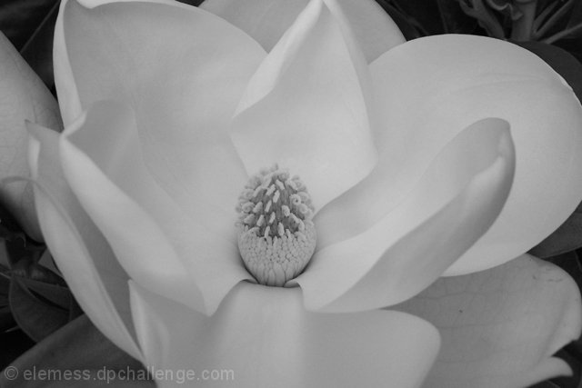
On my machine, this falls a little flat in the contrast area. I want some of this to be a brighter white -- and I think you could probably make the dark areas in the corners of the photo darker without losing too much information elsewhere. But, that might all just be my machine. Otherwise, I really like the composition -- makes me think of Georgia O'Keefe.
Nice contrast and textures. Good job with the white on white thing. Its tough to achieve, and you managed it well. I like the rather soft focus on this, it works well I think.
This photo could've been one of my top votes, the composition is VERY good and white (or pale) flowers do actually lend themselves to b&w I think. However, IMO, the picture isn't quite sharp enough and needs more contrast. I've taken the liberty and played around with it some more. Let me know what you think!
Increasing the brightness a little more would give a nicer range of contrast in the flower (at least on my somewhat calibrated monitor). The very center, in particular, would be improved through greater visible detail.
I think this particular photo is cropped a little too tight... the flower feels 'squeezed' in this view... The white petals of the magnolia don't offer much contrast in the photo... I like a black and white photo that has some sharper contrasting elements...
Great focusing. The detail on the bottom right petal is really nice. Changing the exposure very, very slightly might have brought this out on the other petals.








 Add photograph to your favorites
 Add photographer to your favorites


 Photographer found comment helpful.


