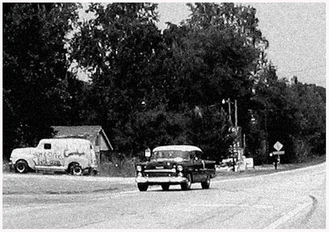
I know most people won't get it but what the heck. This was my first idea. Take a photo of an old car and make it look like that photo was taken close to the year that the car was new. I think I accomplished that.
Edits:
Crop
Desaturate
Played with contrast and brightness
Sharpen
Add Noise
Added white border
Resized
Save for web
Post challenge:
Well it looks like most of you got it. Thanks to all it is my second highest rated shot to date.
Statistics
Place: 73 out of 298 Avg (all users): 5.5517 Avg (commenters): 6.5714 Avg (participants): 5.5583 Avg (non-participants): 5.5471 Views since voting: 1136 Views during voting: 414 Votes: 290 Comments: 22 Favorites: 0
not sure how you managed to make this shot look so vintage, but i am impressed at how old it looks. glad to see i'm not the only one who thought so....
Clever idea to make it look as though the image itself was taken in 1955. I imagine a few folks will be decrying that the content is meant to represent the year not the look of the finish but I kind of like it. On the other hand, content wise it's the kind of image that is just a family album snapshot - someone's new car etc. If it were real I might possibly have vague interest as historical record but in 2005? I just can't find any appeal in the contents OUTSIDE of the fact that it meets the challenge, if that makes sense. What I mean is that if I were giving 5/5 for meeting challenge and 5/5 for appealing to me in it's own right, I'd give 5 and 1. Goodness but I'm rambling away a la Kavey. I'll stop now. :o)
5 - This feels 'real' to me and meets the Challenge in my opinion (this shot printed and put into a time capsule depicts the era for future generations). Criticism; I like the effort you have seemingly made to get the aged effect, but in my opinion there is alittle too much grain, or 'something'. I like the angle, but would like to see the car driving a little closer. Not sure about the frame. To really nitpick, maybe the road sign needs cropping out, not sure. I like the 'feel' mainly though in this shot, just wish it were not quite so grainy.
This is the best vintage shot I've seen. It really evokes a time - the entire image is like a capsule. This is the best entry of the challenge in my opinion. 10
Nice. A good leading line that takes the eye to the auto. Good comp. I like the grain. It works well for this image IMO. Looks like it's straight from the 50's. Good job.
I am in awe of this photo. Not only is the subject matter smack dab on, but the treatment of it emulates the style of the day perfectly: the graininess, the static treatment of the subject, the arttificial distance caused by using a short focal lenghth cheep lens, and so on. Truly inspired.






 Add photograph to your favorites
 Add photographer to your favorites


 Photographer found comment helpful.


