*Critique Club*
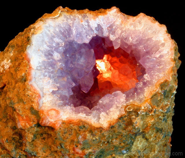
Nice colors! Definately fits the challenge, and I like this because it's naturally occuring.
The black background is great. Nothing distracting there. The angle and framing/cropping is good. I wonder if you could have had this at more of an angle, but probably not. Then you wouldn't be able to see down into the rock, where it's important. Just talking outloud here. lol
No freaky blue grass this time I see. *wink*
Seriously though, I think that the focus is a bit soft, but I'm also thinking that this could simply be because of the textures of the rock. The hardest thing for me to photograph is textures and they always come out looking soft no matter what I do. I'm not really sure how to fix it either. Maybe a side light would give it some depth on the top, create a bit of shadow, and increase the "height" of the inner texture? Then again, It might hinder the lighting that makes the inside so great. *again, just talking outloud*
I tried this with a tighter crop, and I think I like it that way. Up close and personal. Probably even be able to cut off most of the black background. Both ways look good. Maybe for the challenge though, a tighter crop would bring our eyes directly to the innermost part, where the 'important' colors are.
Love the lighting to bring out the orange. I think that's the best part in my opinion. You did a great job making that stand out.
~Heather~
Nice macro, although a little too soft round the edges. If your camera would let you, a narrower aperture would have been nice. I like the lighting from 'inside' the stone.






 Add photograph to your favorites
 Add photographer to your favorites

 Photographer found comment helpful.


