*Critique Club*
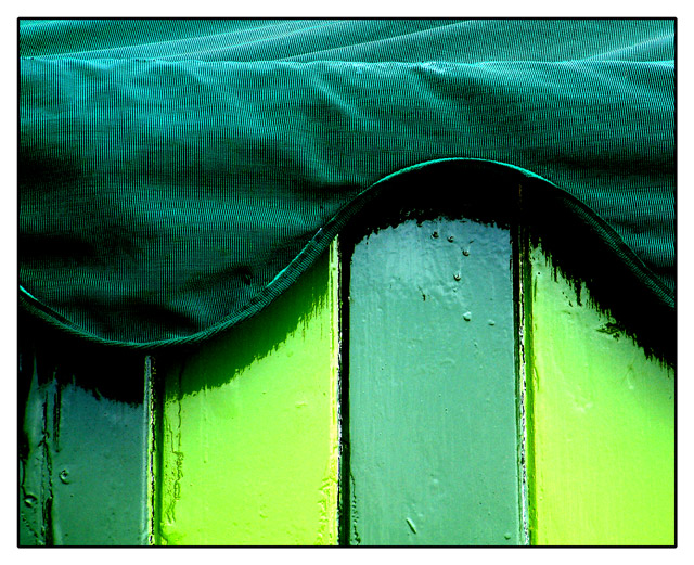
This is a very nice shot. When it was loading (top to bottom) what I saw first was a turquoise color, but when it loaded all the way, it's definately green.
What I like most about this shot is curved lines on top of the vertical lines. I think that is very nice. I like the way that the straight lines meet the curved ones. That is very visually appealing to me.
Focus and clarity are really good. You have captured the detail in the top of the hut and the texture in the wood as well.
At first glance, I thought that the lighting might be a little harsh, creating some reflection on the glossy wood, however, that doesn't really appear to be the case. It's shiny, but not distracting at all.
I like the angle and framing/cropping you chose as well. The way that the vertival lines are nice and vertical, and the way that the curved wave goes across the photo works very nicely. I like how the subject fills the entire frame of the photo.
I really wish I could offer more in the way of improvement, however, I don't think this really needs any improvement. I like it just as it is. Not very often I get to say that. Congrats.
~Heather~
Have come back to this shot from just browsing around the site: really like it now, much more than I did at the time of voting. Two contrasts going on, betweeen the shades of green and the textures, and both excellently brought out. I'd guess it didn't score better because you only used one colour, but I'm not that much of an expert on the dpchallenge communal mindset. Now if those darker panels had been orange ... :)
Well done. I had a hunch you were hiding ice cream in that hut. Hit the hut to remove the hut\'s hidey-hole and pull out the soft, sweet icy treats buried beneath.
nice.......... but the colours are slightly washed out at the bottom...
(edit) after looking at it on another computer screen.... i have changed my mind... the colours are fine... gone from 4 to 7...
Ice cream hut? I never would have thought of painting one shades of green. Very nice photo, clear, attractive, good colours. I like the little rounded corner on the black frame. ~10
Nice image. But shouldnt all the secondary colors be included in this image? Anyway. . . i like the range of green that is incorporated into the image. I also like the way the different textures display the color.






 Add photograph to your favorites
 Add photographer to your favorites

 Photographer found comment helpful.


