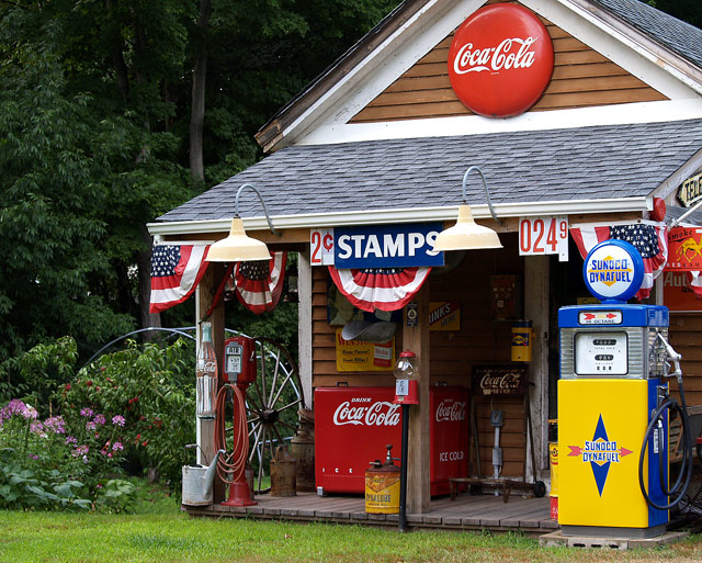
A reconstructed country gas station I had seen in a a yard quite a while ago..fortunately, I remembered where it was and dropped over to take some pictures...the primary colors really caught my eye..tried a b&w and duotone conversion but it just didn't have the punch of the original color image...cropped out a waste basket on right because it had a plastic bag, since there were no plastic garbage bags in 1959...then I used levels, unsharp mask, hue/saturation and curves.
Statistics
Place: 16 out of 298 Avg (all users): 6.2336 Avg (commenters): 7.6667 Avg (participants): 6.1597 Avg (non-participants): 6.2811 Views since voting: 1740 Views during voting: 408 Votes: 304 Comments: 28 Favorites: 1 (view)
.....colours are great, feels "new" in a way. I agree w/ banmorn, not necessarily your aim and intent, but I would also like to see a version with a bit of desaturation or mood edit on this one. It seems it would lend itself well to an intrepretation of nostalgic tone. It is a very interesting restoration of a gas station.
Thanks everyone for your comments..I did try this in duotone and in b&w; however, I liked it in color...felt like I could step into the frame and be in 1955 by keeping the colors fresh..in duotone, it looks like a bygone era, not what I wanted in this case. Thanks for the 10 tens..wow! Who gave me that 1? lol. thank you for the inspiration I have found here at DPC.
Our concept of time is, perhaps, colored by the fading of memory. Absolutely nothing wrong with this with its bright, gorgeous colors...if you are depicting 1955 everything would have bright, shiny and new and saturated with color of being new, not faded and old. People just seem too relate lack of color with the past....but this was a time capsule challenge for which this is perfect and not a nostagia challenge for which mono/duo tones might have been better. Great finish. Congrats on your top 20!
6 - Met the Challenge (I think a photo of this put into a time capsule for said year depicts the era well for future generations). Criticism; I would like to see either a slightly 'wider' angle, incorporating the roof, else a tighter one, with just the 'eave'. All the 'subjects' look pretty authentic to me (maybe the pump?). As for b/w or sepia, not sure on that, I like the colors, but maybe the desaturation may have made it more 'dramatic', not sure.
Nice shot. Great colors on this. I had one of those Coke Signs when I was younger! And can ya tell me where this is so I can go fill up with gasoline? I would have liked to see this cropped just a bit wider and taller to show the whole front of the building.
I have a friend who has an old "gas station" in his yard. These buildings are so cool. I admire those who keep the past alive. O', and a very nice shot too. Love the colors! 9
Although the colors are nice, I think this would look more authentic if it were in B&W. Excellent store depicting the 1950's. Cropped a little close, though.






 Add photograph to your favorites
 Add photographer to your favorites

 Photographer found comment helpful.


