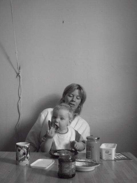
Lighting is good, but the contrast need a bit of adjustmet to capture the full tonal range. The clutter in the background and the empty space on top should be cropped out. The childs expressing is priceless
This falls into the shapshot category for me, not because of the subject but because of the softness of the focus and the distracting elements such as the cord hanging down the wall
Love the angle and the look on Mum's and baby's face. I'm torn between the format, I'm not sure whether the vertical works or whether I'd prefer a landscape format just with the lower half of the picture. In any case, the hook in the wall and the pull-thingy from the shutters is distracting. Also, the image is a tad soft for my liking (unless you were going for that) and could do with just a little more contrast in my opinion. I did an experiment this week by posting reedits (hope you don't mind). Let me know what you think.
IMO this would be better if cropped and just the child - the wall, rope(?) p&j jars on table are too distracting, just the child eating that toast would have been a great photo! what a cutie.
Neat b&w. Composition could use some correction. More focus on the baby and less on the blank/dead wall. However, I like this shot. I'm a sucker for cute kids/moms and real life shots. Nice job.
I'm not sure I understand why you left so much head room. I think if you'd gone with a 640x480 vs. 480x640 and gotten rid of the cord in the background... this would have been a much better shot. Nice expression/face stuff by the kid!
Very sweet... I wish you had cropped a bit more. As the picture came up on my screen, I first saw the nail in the wall above their heads, and I thought the title (breakfast) referred to a fly on the wall or something.
I think this photo would work much better with a little more zoom and the subject filling more of the frame.. I think the dead space at the top of the photo is a bit much...





 Add photograph to your favorites
 Add photographer to your favorites


