Gary, this is a fine, fine shot. I am even more impressed to read the details and see that it was taken at iso 800! Wah! If I tried that with my cam it would be so grainy you would scarcely be able to tell what it was.
Anyway, many congrats on your first ribbon! I'm sure there will be more to follow.
Shame on you for not using real Snapple(TM)! As we all know Snapple(TM) does not have any blue products! Your obvious attempts to sway the voters should earn you a DQ! ;) (Well you did say you wondered when someone was going to comment like that...:))
Did you have an assistant for this shot? I can't imagine being able to do it with just one set of hands. This is really a great shot. Very creative and amazing how you actually pulled it off. Congratulations!
Looks refreshing, but how does it taste? :-P If it were me, I think I would have cropped a bit off at the top, say 20 pixels or so, to focus the picture more on the glass. I'm not sure if I like the dark lower corners or not. One one hand they add some depth to the image. On the other, they attract my eyes away from the glass.
Cool. I like this idea. How do you pour and shot at the same time. Should get a helper with my shots. To nit pick an otherwise great shot, the two snapple bottles are uneven, but the liquide crosses over very nicely. 9
Nice effect, good idea and well executed. This is a good one. Well done. Bottles aren't even and I'd like to see them not clipped (and without the best before date).
Very nice, original. The blue bottle is much less lit then the yellow one and maybe more light on the bottles and more even would have been better. I like it a lot though.
This is fun. Are you the one perhaps behind all these color challenges? From looking at this, one might say color theory is your thing :) Well done and creative thinking. The lighting on the background is rather uneven. 8
Fine work! so well set up - I like the green as the two streams cross oneanother. You've really got the feeling of liquid, and the mixing of colors. One tiny, small distraction the darker gray in the bottom corners - wish it were all white. 9
Really creative use of secondary colours. This could have worked better for me with a lighter background, with less graduation... it takes away from the foreground for me. Still one of my favourites though! 8
this is just so cool....... top marks... you pulled it off so cleanly.... bet it took you ages to get it right.... only complaint is a slight blue tinge to the back ground... but you still get a 10!





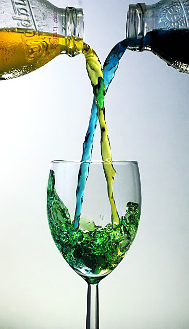
 In The Mix
 Add photograph to your favorites
 Add photographer to your favorites

 Photographer found comment helpful.


