*Critique Club*
I like this, and I can see what you were trying to do here, and it's a great idea.
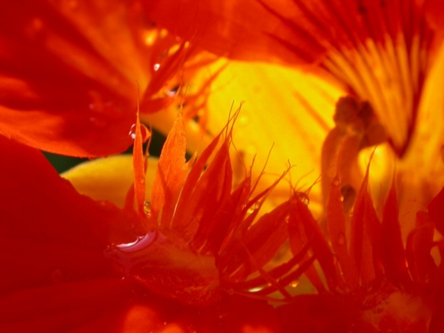
I do have to agree with some of the other commets though that the important part (in my opinion) seems to blend in a lot with the surroundings, making it seem a but mushed.
The color is beautiful. I like how it take up the whole shot, but unfortunately it also absorbs some of the detail as well.
I almost missed the water droplet, it's hidden down there in all the color.
I am glad for the small patch of yellow in the background, it does help the little wiskers in the middle to stand out a bit better than the rest of the shot.
A really pretty macro. Just maybe TOO much color. lol
~Heather~
i think you may have gotton to close to the flower, you can't really tell what it is but the color is very bright and i like the focus so i give you a 8
all a little to close up for my liking... looks a little like some sort of seafood... haaahaaa... anyway... perhaps somthing that gives a little more contrast in the background would have helped.. 6
neat. almost too cropped in however, and the backlight doesn't allow you to fully see and appreciate the in focus parts in the forefront. the color looks great.
Not much definition here. It is hard to see what I am looking at. Maybe a cahnge in lighting would have given more contrast (more shadows). I would have added a simple white boarder...






 Add photograph to your favorites
 Add photographer to your favorites


