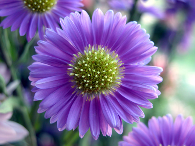
One thing really jumps out of this image at me, and that is the light. The exposure is perfect to capture it (this after all, is what taking a photograph is), and it's from that that the tonal range of both the purple and the green is so rich and so wide. Remarkably good detail for a low-light handheld shot too.
As others have commented, the petals do seem to be just fractionally out of the field of focus - I could see a reason for this, given your title: to aid the illusion of a bursting out of something, but if that were the case I don't think you've gone far enough with it, so what it looks like now is that you've not quite got it right. Very close, perhaps half a stop more aperture, or perhaps I mean less - f/4.0 say.
Compositionally the two background flowers are good too - give a dynamic to what would otherwise have been purely a flower portrait. The brightness ot the right of frame is a pity - pulls the eye away from your primary subject: a shame you couldn't have shaded it with something (though you'd fall foul of the school of 'mustn't tamper with nature').
This is good work, and is a good result for a first challenge - hope you'll submit many more, I'll be interested to see your approach to other subjects.
A very straightforward, head-on macro shot of a blossom. There's nothing that particularly excites me about it, but it's executed in a very technically-proficient way, so I have to give props for that. :-> Would make a good mousepad or coaster, I think.
An awesome photo. Colors and lighting are near perfect. For my own personal taste, I would have liked a little sharper focus. Still, it is a very beautiful picture.
very nice detail and DOF - almost too much DOF, maybe i would have prefered for the complete front flower to be in focus rather than just the center. because the right side has more light than the left side, you might have rotated the picture to make it a top or bottom brightness, which i think the eye handles better than a left/right unbalance.
Wow. Gorgeous mix of color. Very nice detail in the middle of the flower. I feel that placing the flower in the middle to be very appropriate here. Good job of your using secondary colors. My first 10. Jacko. :)






 Add photograph to your favorites
 Add photographer to your favorites


 Photographer found comment helpful.


