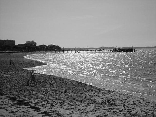
I'm torn on this one, can't decide if I like it in b&w or not. I like the light bouncing off the water, but wish to see the blueness of the water - ah well, can't have everything ;) good job.
I like the sun's reflection off the water, very nice. (I know they couldn't be helped, but I don't like the people on the sand; a distraction, but hardly visible.) Your horizon has some "ripples" that are barely visible (yes, a REAL NIT), could have been caused by many things, like overblown up, too much digital sharpening, etc. I'm not going to grade you down for these really insignificant items, just thought you might want to know. Photo 9 Creativity 6 B&W 8 total 7
The view on this photo is excellent... It looks like the sun may be in front of you and that probably shortened up your shutter speed.. The shorter shutter speed caused the darker areas in your photo (the beach and the people on it) to become under exposed...
this image is only 78k and the low quality is very evident in the sky. i'd recommend taking the picture in the highest quality that your camera will allow and then using photoshop to resize to 640x480 and the highest quality possible under 150k.
This picture is almost too sharp, and a little too bright in the water.. I do like the way you have gotten the curved motion of the water, and how it contrasts with the straightness of the pier.
Personally, I feel that beaches often work better in color than b&w. The people on the beach could be subjects int he photo, but they are too much the same shade as the sand. Also, the horizon seems a little tilted.
I like the effect of the picture dividing into 3 zones: shadow detail, highlight details, and no detail. I'd like to run it through a bunch of blurring filters and see how it would look asthe basis for an "abstract" piece...







 Add photograph to your favorites
 Add photographer to your favorites


