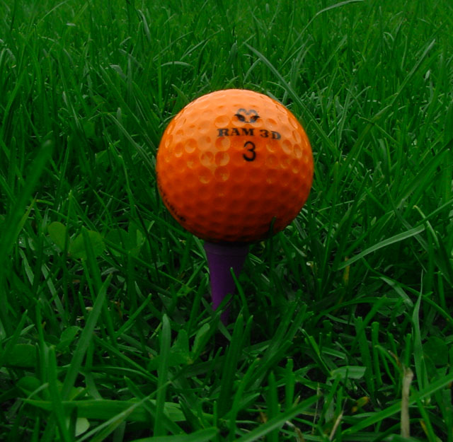
Great idea...... but as i am sure you have heard already..... would have benifited alot by increasing the brightness levels and perhaps putting the subject a little off center (rule of thirds)........ good luck
Good find to get all the secondary colors. The little things mean a lot -aligning the lettering and putting the lettering in sharp focus would have raied it above a 7.
Nice vivid colours. I would have put the tee in the bottom right or bottom left corner depending on whether you're a righty or a lefty. I think that would have given more impact.
Great use of the the three secondary colors. I'm a golfer so I love it. Seems a bit dark. You might want to boost it up in Levels or Curves. Good luck. Jacko.





 Add photograph to your favorites
 Add photographer to your favorites


